
Back in October 2019 and March 2020, HHSL Staff walked around and counted how many people of each program were around the library. You may remember us, with the clipboards, asking that question.
Or…to be more accurate, we walked around throughout October, and half of March. We didn’t actually end up getting all of the dates we had wanted to in March (apparently there’s a global pandemic on), so we ended up with a truncated version of the survey for that month: 4 days of data instead of 7. Still, when it comes to trying to make a better Hirsh Library for everyone, even truncated data is better than none! So here’s some of what I can see.
Fair warning: I’m going to have to extrapolate and make a couple of assumptions here, since we’re missing so much of March’s potential data. I’ve seen enough data over the years to have a good sense of what it would be, but what should and what is are always different, so maybe get a salt grain ready to take with this post. Finally, the Y axis is always going to be Number of People Counted in this post, because I want this to be as easy to read as possible!
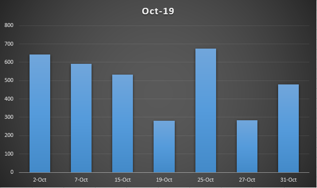
Click to enlarge.
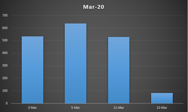
Click to enlarge.
So, here’s the base data. October 2019 and March 2020. As you can see, we counted…actually not that many more people, all things considered. March 3rd, 5th, and even the 11th were all right in line with what we saw in October, in terms of library population. In fact the difference between the most populated day in October and the one in March is only 34 people. Which is great!
In case you’re wondering what happened on March 13th: that was the last Friday we were open normal hours. Staff, faculty, and students were already voluntarily staying home to work from there to keep themselves safe from the rapidly growing COVID-19 threat. On March 15th, the following Sunday, Tufts made the decision to close the campuses, and Monday the 16th was the last day the library was physically staffed in person (as a note, we are very much here for you online). So what you’re seeing in that data is the effect the virus was already having on the life of the library. March 11th: relatively normal day. March 13th: signs of a new normal.
But we’re not here for discussion of the virus, we are here for discussion of the data!
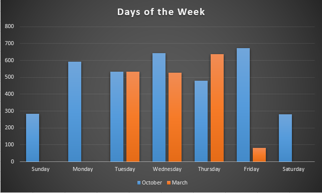
Click to enlarge.
So, this is the same data as above, but oriented on what days of the week a given date was. Although the by-the-date data has its place, it’s good to know, say, what a week looks like. This is what a week and a half look like! And this is where that missing data makes me sad, because we’ll never know what the other days looked like in March. Traditionally, the weekends are the slowest days of the week, and the busiest tend to be Tuesday-Wednesday-Thursday. This is mostly matching, but…what was with that October Friday? My instinct is that it was an aberration, but without seeing in March it’s hard to tell how much of one it was. That a Friday was the busiest day we counted in October tells me that there must have been an event that day (a meeting? exams? a conference, perhaps?), but maybe it just chanced to be close to an exam.
In the end, one surprisingly busy day does not a library make. But it’s still fun to think about. Especially when you compare calendars to the data and realize that Friday, October 25th, happened to also be the second day of our pumpkin painting. Coincidence?

I think not.
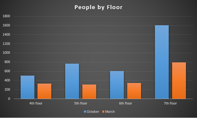
Click to enlarge
Okay, last two charts! The first is the People by Floor. So this ignores dates, and focuses on the aggregate. One thing I’ve been noticing in the last year or so is that the counts we get on the 7th floor are always roughly twice that of the next closest floor (which alternates). As you can see from October, that sometimes makes for some goofy looking charts. This is one of those rare cases where the missing data actually won’t make any real difference. Barring anomalies, what you see with that chart falls in line with years of existing data. That one is one I always predict with easy clarity. Which brings us to the final, and everyone’s favorite: programs!
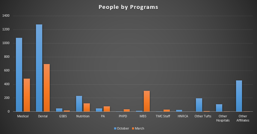
Click to enlarge
This is sort of wild to look at. So, okay, Dental and Medical are the programs dominating the numbers. That makes perfect sense, and honestly outside of minor variations, that’s what tends to happen. They were close in October, though, so I would have loved to see what those numbers looked like in March. Especially given the sudden notable presences of PA, PHPD, and MBS. Look at that MBS presence in March! That’s so great to see. I love it when I see sudden jumps in the number of people in the library. We’re here for everybody, after all!
That’s it for me today. Thank you for reading along, and I hope to see you all online this summer, where we are all seven days of the week. If you’re unsure the best way to reach out, well, try checking out our Ask Us page. Or hey, you can still Schedule a Consultation. There are lots of options.
And remember: wear your mask.

Photo credit: Tarlan Sedeghat
Stay safe everyone,
Tom
Share this post!


Follow Us!


