by columnist Catherine Sigmond
Lately I’ve been working on a project to evaluate and rapidly redesign the Mammal Skull Mystery exhibit at the Museum of Science. After weeks of evaluating how people use the exhibit (read: stalking visitors and then awkwardly trying to talk to them about it) and reflecting on those observations, we’re now in the storyboarding phase of the design process.
As we prepare to start discussing our high-level vision for the new exhibit with stakeholders at the museum, I thought that I would share where we are so far and a little bit about what’s influenced our designs.
Here’s what the exhibit looks like now:
At the current exhibit, visitors can touch and examine seven different mammal skulls. After indicating that they are ready to try and solve the mystery of a skull’s identify by pushing a button, they are guided through a series of questions that are supposed to encourage them to look closely at the skulls and use their observations to classify the mammals.
It’s a great concept, but there are a lot of problems with this exhibit. The line of questioning is often misleading. Images that appear on the screen and that are intended to help visitors identify certain skull features are difficult to see. The system doesn’t know which skull a visitor has chosen to identify, so people are often (understandably) confused when the computer tells them that they’ve correctly identified a skull yet they are holding a different one in their hand than the one that appears on the screen as correct. It’s difficult for groups to use together, and especially hard for kids to use without guidance from an adult. Not to mention a whole host of interface issues- broken skulls, screen images that don’t correspond to the audio, and an entire screen that visitors hardly even look at.
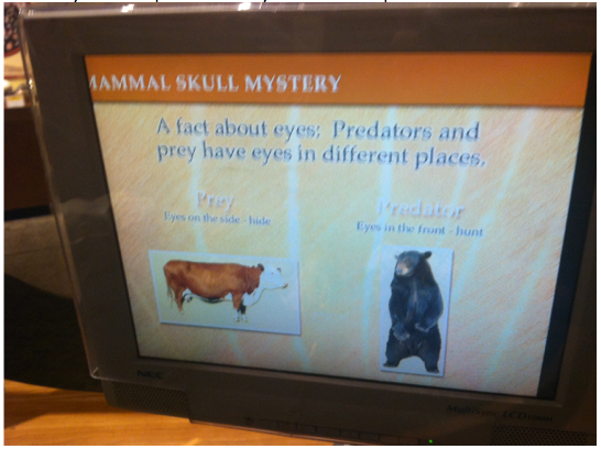
Take a look at this screen, for example. The question asks visitors to look at their skull and identify the shape of its eye sockets.
But on the screen that follows, the information presented to the visitor is all about the importance of the position of the eyes on the skull. There’s never any follow-up about the eye sockets’ shape.
Our data showed that this was consistently confusing for visitors. What counts as a “nearly-completed circle?” Why is eye socket shape important? You won’t find out at this exhibit.
Since our project is for a class on designing technologies for collaborative learning, we focused our redesign on two main ideas: enhancing the role of collaboration and improving the exhibit’s interactive media.
We want to make something that will encourage groups to use the exhibit together, provide opportunities for multiple groups to use it at once, clarify the important content and make sure it’s presented in a flexible, but logical order, and give the visitor control over what content they access and when they access it.
So, in the interest of crowd-sourcing some feedback on our redesign, check out this short video we made using SAM Animation to convey the main ideas of our high-level vision for the new exhibit. See it here: Mammal Skull Mystery Storyboard.
There are a lot of details we didn’t mention in this video, so if you’re interested to learn more, have questions, or want offer a suggestion I’d love to hear from you! Stay tuned as we begin paper prototyping our designs. And if you really can’t wait to see how Mammal Skull Mystery evolves, definitely get in touch. We’re looking to prototype both with visitors in the museum and users outside the museum and we could always use more participants. The more user feedback, the better the final design!


Leave a Reply