

Yutong Chen, MS, MPH
PhD Candidate, Nutrition Epidemiology and Data Science, Friedman School of Nutrition Science and Policy, Tufts University
Yutong Chen’s research topic focuses on dietary patterns, inadequate nutrition consumption on a global scale, and data visualizations. She graduated from Tufts with a dual master’s degree in Nutrition, specializing in Nutrition Intervention, Communication, and Behavior Change, and Public Health, focusing on Epidemiology and Biostatistics. Since the summer of 2021, she has been a part of the Global Nutrition and Health Atlas (GNHA), where she applies her expertise in big data and data visualization as a data analyst. Alongside her work at GNHA, Yutong is actively involved in research related to COVID-19 booster strategies, collaborating with several faculty members from the Tufts Public Health department.
Final Presentation
Final Project
How to Use AI to Analyze Information Collected for Understanding Complex Nutrition Data Visualizations
Key words: Data Visualizations, Qualitative data analysis, AI analysis, machine learning
Project Description
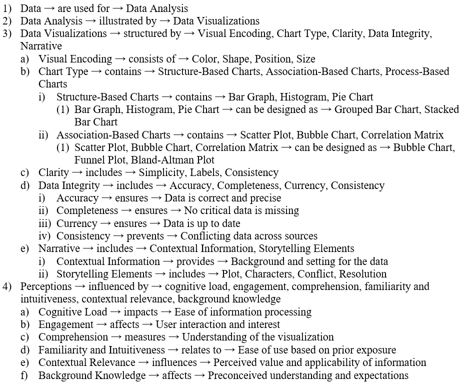
Data visualization plays a pivotal role in how information is communicated and understood, significantly influencing user perceptions and the effectiveness of data communication. These visualizations are constructed using various elements like visual encoding, chart types, clarity, data integrity, and narrative, each of which plays a critical role in shaping how information is received.
Understanding the perception of data visualizations is crucial as it influences how effectively information is communicated and comprehended [1]. Visual encoding utilizes aspects such as color, shape, position, and size, which can either simplify complex data for better accessibility or increase cognitive load, making data overwhelming. Different types of charts like bar graphs and scatter plots are selected based on their suitability for the data structure or the relationships they need to highlight, which directly influences user engagement and comprehension levels. Clarity is paramount and is achieved through simplicity in design, clear labeling, and maintaining consistency across the visualization, ensuring that the information is straightforward and easy to understand. Maintaining data integrity and providing accurate representations are essential for building user trust and credibility. A strong narrative that includes relevant contextual information and effective storytelling can enhance the emotional response and retention of information. For instance, using a consistent color scheme can reduce cognitive load and a well-designed scatter plot can expose correlations that might be missed in simpler representations. Ethical considerations are also crucial. Data visualizations should be created with transparency, accuracy, and inclusivity to avoid misleading representations and ensure they are accessible to all users. These considerations include addressing how visualizations are perceived when generated by AI versus those created by humans [2, 3].
In the field of nutrition, data visualization is extensively utilized to communicate research findings and educate the public, using tools like MyPlate, informational sheets, and various educational materials. With advancements in machine learning (ML) and natural language processing (NLP), it is now possible to create more tailored and comprehensible graphs and infographics suited to different audiences. Despite much research focusing on the development of AI-generated data visualizations, there is limited research on how these visualizations are perceived compared to those created by humans. This study aims (1) to compare the comprehension, perception, and effectiveness of AI-generated versus human-created visualizations, (2) to assess how different levels of descriptions in human-created graphs affect understanding, and (3) to analyze responses collected regarding the barriers to comprehending nutrition data visualizations using NLPs.
This study seeks to fill the research gap by comparing the perception of AI-generated versus human-created visualizations in nutrition data. By analyzing responses collected via platforms like Qualtrics, this research will assess comprehension and perception differences across various types of visualizations. The study will involve students and postdoctoral fellows from Tufts University, exposing them to different levels of descriptive detail in human-created graphs and AI-generated graphs. A mixed-methods approach, combining quantitative surveys with qualitative focus groups, will be used to gather comprehensive feedback on the visualizations. I will use NLPs to analyze the survey and focus group responses. Anticipated results are expected to provide insights into how different visualization types are perceived in terms of clarity, evidence, emphasis, and efficiency. This could reveal significant differences in comprehension levels, highlighting the strengths and weaknesses of each visualization type and influencing the design of future educational materials in nutrition.
By addressing these aspects, the study not only aims to enhance how nutritional information is communicated to the public but also contributes to the broader body of knowledge regarding the application of AI in data visualization. This research will ultimately aid in improving educational outcomes and public health, making nutritional data more effective and accessible.
AI Ethics Statement
Ensuring AI systems used for creating visualizations are transparent and accountable is crucial for the integrity of the research. Participants should be informed about how these visualizations are generated, and researchers must ensure their accuracy and integrity. Transparent processes help build trust and allow for proper oversight. AI-generated visualizations should also be fair and equitable, avoiding biases that could misrepresent data or mislead interpretations. This involves careful consideration of the training data and algorithms used to ensure they do not aggravate existing inequalities or introduce new ones. Visualizations with AI-generated descriptions should also be culturally sensitive, accurately representing data in a way that is respectful and relevant to diverse audiences, considering cultural differences in data interpretation and presentation styles. Transparency and accountability are the most critical aspects because they underpin the trustworthiness of AI-generated visualizations; without clear processes and accountability, users may doubt the validity of the information presented. Fairness and equity are equally crucial, as biased visualizations can lead to misinformed decisions and perpetuate health disparities [4]. To address these ethical issues, a comprehensive policy framework involving transparency to participants should be implemented, detailing how the data visualization is developed [5]. Addressing these ethical issues will lead to more reliable, fair, and culturally sensitive nutritional data visualizations, enhancing public trust and improving educational outcomes.
Knowledge Graph

Ontology:
Conceptual/Causal Diagrams:
References:
1. Pineo, D. and C. Ware, Data visualization optimization via computational modeling of perception. IEEE transactions on visualization and computer graphics, 2011. 18(2): p. 309-320.
2. Etemadpour, R., et al. Role of human perception in cluster-based visual analysis of multidimensional data projections. in 2014 International Conference on Information Visualization Theory and Applications (IVAPP). 2014. IEEE.
3. Few, S., 35. Data visualization for human perception. The Encyclopedia of Human-Computer Interaction, 2013.
4. Israel, M.J. and A. Amer, Rethinking data infrastructure and its ethical implications in the face of automated digital content generation. AI and Ethics, 2023. 3(2): p. 427-439.
5. Bendel, O., Image synthesis from an ethical perspective. AI & SOCIETY, 2023: p. 1-10.
Hi Yutong,
I enjoyed your presentation and appreciated your focus on clarity and comprehension. Comparing AI-generated and human-created visualizations will provide valuable insights into the effectiveness and perception of these tools. I look forward to seeing the results!
Hi Yutong,
You did a great job with the ontology, knowledge graph, and conceptual diagrams. I like how you highlighted transparency and accountability as two key features in the ethics section . AI generated visualizations feel like a slipperly slope to many people (myself included!) and you are absolutely correct in centering ethics in your project in order to ensure that these tools remain trustworthy.
I love that you discuss the relationship between data visualization design and how it impacts the resulting perception and
accurate understanding of the information conveyed therein. Understanding the nuances of how humans perceive AI generated visualizations is important given the seemingly small details that are necessary for an impactful visualization!
Great points made Yutong!
Hi Yutong! This is such a great use case for AI in nutrition research. I am wondering how you could also adopt this model/proposal to evaluate how policy makers intrepret nutrition data/information/visualizations? I am also curious as to how you would allow this model to evolve when we change how we present the information. Could you use AI to be on the forefront of developing new visualizations to present data? Great work!
Hi Yutong! Very thorough and clear project! Your knowledge graph is very impressive! The methodological approach of using a mixed-methods design to assess these visualizations is particularly robust, allowing for a thorough analysis of both quantitative and qualitative aspects of user interaction.
Hi Yutong, great job! This was extremely well thought out and I am extremely impressed with your knowledge graph. The way that data is visually presented is so incredibly important to how people comprehend and interact with information. I greatly look forward to where this research takes you and employing your results in future work!
Yutong! Very well done. The knowledge graph and concept maps you have created here are clear and easy to follow. Data visualization can bridge the gap between researchers and non-researchers, and doing so efficiently and effectively with AI is exciting. I am excited to see your future work.