
Currently viewing the category:
"Academic life"
Academic spam is a real problem. Every day I get many emails inviting me to fake conferences and pretend journals. This junk mail is clever enough to pass through automated filters, and to fool just enough students and researchers into paying for their useless services — or tempt them into trying to fool employers with a puffed-up CV.
It takes time and attention to distinguish fake from real. Much has been written about the problem. The pioneer effort is Beall’s list, followed by other efforts to stop predatory journals and help people choose better outlets. The pay-to-publish and pay-to-attend industry even puts out their own guide to using their services, encouraging people to think and check before submitting. Some academics are really into this, with fun blogs about flaky conferences and flaky journals, or this fancy Christmas joke.
This year I started building my own blocked senders list of sites that have sent me academic spam. It’s pretty easy: instead of deleting the junk, I add the sender to my blocked list. This takes a couple more clicks, and I’ve ended up with a list that looks like this:
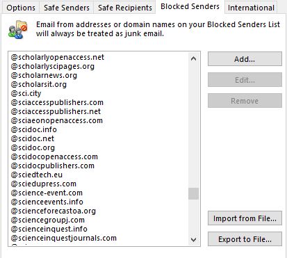
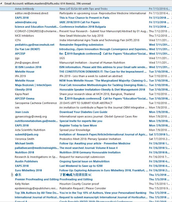
My list of about 400 senders now catches about two-thirds of the incoming spam, sending it directly to the junk folder. The filtered ones are in bold, unread, in case you want to check what was blocked:
I did this partly for myself, but also to share the list online so others could import and add to it, here: http://bit.ly/academicspammers.
With a little crowdsourcing, we could all enjoy a less spammy future.
It’s the first weekend of a new semester – time to take stock and set direction for the spring. As Anne of Green Gables put it: ‘a new day, with no mistakes in it yet’.
With that… time for what might might be my first mistake: an overly long blog post. In the past I’ve used this site to post short roundups of great new stuff from the internet, with links to some of the best ideas that feel new to me for the start of each semester. Topics have included filter bubbles, redefining sustainability, song lyrics, ethical economics, teaching economics, and data visualization. My goal is share ways to avoid previous errors, so when I do make mistakes at least they’ll be new ones.
In 2017, the whiplash transition from Obama to Trump has shaken every aspect of American life, down to the root of rethinking how we talk about race, gender and other aspects of who we are. That calls for many things, including perhaps the need to address those issues more directly in this kind of blog. Taking on something so fundamental as social identity means my mistakes could be bigger and more consequential than usual, but I hope they are not quite the same old errors as in the past.
For NUTR 238, our focus is how economics can help improve the food system. Economic analysis starts with individuals’ choices, and there is now a lot of economics about how we form and use various identities. What sort of person do we want to become? How do we categorize other people? Identities like being a vegan or an environmentalist play huge roles in our food choices, and could even cause bias in nutrition research.
Many features of social identity are inherited, and change only gradually. My own family name was changed completely by my great-grandfather on arrival in Boston. My father’s parents changed it again, to sound even more English. Identity evolves in part through choices like that – and yes, there are economics studies of this, both family names and first names.
Each of us has many interacting identities, of which some aspects are private and others can be used as a public signal. Many signals involve things we say, including what we say about race and gender. A meta demonstration of this is one of my favorite signs from the women’s march of January 2017: If it’s not intersectional, it’s not feminism. That sign says a lot, including: I am a person who uses the word ‘intersectional’.
By definition, the meaning of a social identity is what other people make of it – especially distant people, who don’t know the real you. As the old joke has it, a loving parent might say their kid in a new uniform, “To me of course you’re a real captain, but… to a captain are you a captain”? We can alter our own social identity through our names, our language and clothing – and we can also contribute to how others’ traits are interpreted, including immutable traits like skin color.
Regarding racial identity, as a white professor in a largely white school, my own change of perspective begins with Seeing White. It’s a long-form podcast, 14 episodes each of which runs for 30-45 minutes. New listeners might start with the last episode on transformation that includes a lot of solid economics. Agriculture and nutrition are mentioned only in passing, but the question of food justice does appear; in that last episode Robin DiAngelo describes her own initial self-perception as “of course I’m not racist — I’m a vegetarian!” As an aside, this series with a nice personal connection to our field because the co-host’s mother is a prominent nutrition professor.
Regarding gender dynamics, my job is a lot easier. The Friedman School’s student population is about 85% female, and the faculty about 65% female. There are plenty of problems in the field of nutrition, but teaching at Friedman is an escape from so much more sexism in economics. In NUTR 238 we already devote a lot of class time to gender as a topic, and on all topics I feature the work of many great female economists so students will know it’s not all men. I also try to manage classroom dynamics in a way that will help students express their own point of view. I rarely call on anyone until they raise their hand, to encourage self-motivation, and gender disparity in classroom participation runs so deep that by week 3 or 4 there’s inevitably a moment when raised hands are almost all male. That’s what we call a teachable moment: I can stop the class to ask why – and point out that everyone else needs to speak up for their own perspective to heard.
Most importantly for our work at the Friedman School, thinking about diversity and inclusion includes discovering the unintended consequences of our own identities within the food system. The big change in the NUTR 238 curriculum for 2018 will be on that front. I will try to do even more than in the past regarding racial, gender and other disparities in the food system, but what I’ll add for the first time is the possibility of unintended harms from identities over which we have more choice: for example, that ‘healthism’ might worsen weight discrimination, or how the food movement affects the urban-rural divide.
When talking about identity and its consequences, we’ll surely make mistakes – but if we learn from each other we can make some real progress. On to a new semester!
A big part of economics is data analysis, which starts with data visualization: “seeing like an economist” means looking for patterns across many observations, recognizing that the data we see result from peoples’ choices. In class we practice this through weekly exercises and a course project that start with analytical diagrams (such as supply and demand curves) to show the logic by which we explain each observation, and then download data from authoritative sources to make our own charts and tables that summarize what’s been observed.
Here is a great example of the result, from weekly exercise #10 by Dana Bourne in Spring 2020 (updated from when I first posted this in 2017):
Everything about that chart should be self-explanatory, giving readers the big picture at a glance and many rich insights from deeper examination. To help improve data visualizations this blog post pulls together a few suggestions and links for convenient reference. The dataverse of available information is expanding rapidly, with increasingly sophisticated expectations as shown by the many images one gets from a google search for data visualization.
My favorite guide to data visualization for policy audiences is from the UK: https://gss.civilservice.gov.uk/policy-store/introduction-to-data-visualisation. That guide shows clearly how to feature the story told by your data in various settings. Many other sources reinforce the message about removing unnecessary ink, so the data pop out as explained in great posts about how to clear off the table and remove to improve to avoid numbo-jumbo. As with writing, it’s often best to start with a sloppy first draft then clean things up. Successful data visualizations help you tell a story, by making comparisons that highlight both similarities and differences. It’s useful and fun just to browse through the different charts presented here: http://www.ers.usda.gov/data-products/chart-gallery.aspx, and also click through https://www.ers.usda.gov/data-products/data-visualizations.
Charts and tables offer a kind of language designed to help us communicate clearly. The best charts and tables for scientific audiences are like those for policy audiences, except that you can squeeze in a bit more information. Some great advice on that is here: http://abacus.bates.edu/~ganderso/biology/resources/writing/HTWtablefigs.html. Different fields use different conventions about table or figure titles and footnotes, and have preferred visual styles for how things are presented. In general, economics and other social sciences use brief titles above the chart and detailed notes below it, while many health science readers expect a single long figure caption that combines both kinds of information. Examples from my own recent papers include one in health economics style (title and footnote), and one in health-science style (a long caption)
For oral presentation, your charts and tables should appear in ways that help you tell the story. There are many good guides to using PowerPoint effectively, of which one of my favorites is from a prominent biologist named Susan McConnell: https://www.ibiology.org/professional-development/designing-effective-scientific-presentations.
And finally, if you’re interested in guides to writing in general, my favorite is Steven Pinker’s Sense of Style — especially for his brilliant description of how all communication requires effort to overcome the curse of knowledge, in part by chunking information into digestible units which you can then bundle up into increasingly powerful stories. I look forward to seeing how you put your pieces together!
It’s a new school year, time to rethink what we teach!
America’s 2008 financial crisis and its consequences led to long, fierce debates over the past decade about what went wrong in the economy, and how what’s taught in economics classes should change. Among professors, the Institute for New Economic Thinking (INET) plays a big role, and it’s flagship Curriculum of Open-access Resources in Economics (CORE) textbook has been getting a lot of attention this Fall.
Many ideas from INET and CORE are already woven into my teaching, based on their role in the scholarly literature. For example, I have used the Piketty and Saez data on income distribution ever since they first appeared in journal articles, well before the financial crisis. But N238 differs in many ways from standard introductory economics classes. We just had an email exchange among a few Friedman School faculty about this and I am keen to hear what others think it, so I’ll post a few some notes here in hopes of sparking conversation about what’s taught in this class.
First, the innovations brought by INET and CORE aim are about responding to the 2008 recession with more attention to contemporary macroeconomics, regarding a country’s income level (growth and fluctuations) and income distribution (production, employment). In contrast, the focus of our syllabus is entirely on how economics matters for agriculture, food systems and nutrition. Within nutrition we focus mainly on dietary intake, with two whole weeks on details of consumer behavior that are almost entirely omitted from the CORE textbook.
Second, the definition of economics used by INET and CORE is that economists study income flows. Hence the title of their book is “The Economy“. In contrast, the title of our class and of the background textbook we use is “Economics“. The difference is important because we define economics as a method, not a topic. We use economics to study all aspects of agriculture, food and nutrition, including many aspects of individual behavior and social outcomes that do not involve money. Economics is just one of many ways to study these things, which can also be analyzed from other perspectives such as anthropology, sociology, history, or epidemiology. By the end of each semester in N238, students should have a pretty clear sense of the difference between “the economy” (meaning what’s measured as income) and other things that matter for nutrition and can be studied using economics such as gender bias in time use within households, or consumer response to coupons and vouchers, or the impacts of home gardens on diets.
Third, the target audience for INET and CORE is students who really want to study economics as such. The CORE textbook is written in a rather dense, abstract way that does not aim to reach the casual reader. My aim is to teach in way that doesn’t require a textbook at all. Class slides use updated data, and students who want a text for alternative explanations of basic concepts are encouraged to buy an inexpensive older edition. I also point students to the relevant Khan Academy videos. That solves the textbook pricing problem, and allows us to focus throughout the class on customized material about agriculture, food & nutrition.
So… I am keen to hear from anyone interested in curricular issues. Can you see ways to teach economics more effectively, in this or other classes?
If you took the NUTR 238 final exam last week, you’ll know that this year’s questions involved news clippings from the past month’s food policy news, about SNAP restrictions, trade policy, pesticides and monopolies.
Now that class is over, a great to new way to follow these and other stories is via the Tufts library’s new subscription to an daily newsletter from FERN called AgInsider. You can get the daily headlines via email by signing up at thefern.org (scroll down to see link), and if you have a Tufts login you can see the articles here.
For Tufts affiliates, one useful trick is to have your browser redirect the newsletter links to that library subscription. I use this one: http://einaregilsson.com/redirector, for which the configuration is:
https://thefern.org/ag_insider/*
https://thefern-org.ezproxy.library.tufts.edu/ag_insider/$1
https://thefern.org/ag_insider/xxx
→ https://thefern-org.ezproxy.library.tufts.edu/ag_insider/xxx
Main window (address bar)
Among other newsletters my top choices are: for US food news in general, the brilliant New Food Economy’s Weekly Dish; for US food policy news, Politico’s Morning Agriculture (subscription needed for Pro articles only) and Farm Policy News (was subscription only, now free thanks to Univ. of Illinois); for global food issues, the Chicago Council’s weekly Food for Thought news brief.
And if you actually get away from the screen occasionally, I’ll toss in a plug for the podcast revolution: I don’t have a favorite one on food policy – instead I occasionally listen to stuff about food culture, like Gastropod, Sporkful and the Eater Upsell, lots of academic wonkery with Tyler Cowan or LSE lectures, and find many great episodes about food policy issues on Planet Money. Fiction is good too, with great scripted drama like Bronzeville and Homecoming, and yes, music: my beloved Econotunes, and songs that play with food.
Happy summer!
Will
It’s January 2nd, time to get ready for the year’s firehose of food-related news and data.
Our daily challenge is to make sense of events, without retreating into a comfy filter bubble. Economics can help with that. For students registered in NUTR 238 our course website is now up. Class will start on January 15th, and eventually get into news analysis exercises to diagram the economic principles behind current events, and data analysis exercises to visualize comparisons over time and across countries. Before then, or if you’re just browsing, here are some shout-outs to some numbery news sources for the year ahead:
— My vote for best newspaper innovation of 2014 goes to the New York Times’ Upshot, whose launch was itself newsworthy. Among their great food stories last year were the Fried Calamari Index, and What 2000 Calories Looks Like.
— One media surprise was the rise and rise of podcast journalism. Not just Serial, but also the great Planet Money and NPR econo-news , with fun food stories like Why is Milk in the Back of the Store, and When Do Chefs Buy Generic Foods?
— The dataverse just gets denser and denser, with better and better data visualization. My vote for best quick advice is these great posts about how to clear off the table and remove to improve. In class we’ll see a ton of numbers, try hard to avoid numbo-jumbo,and do our best to be use data thoughtfully like this great chart on how gluten diverged from celiac.
The food world is full of surprises – so keep an eye on food-related news with sites like the food, nutrition and agriculture sources to your right, and if you’re enrolled in NUTR 238, use this blog to share what you find.
Happy new year!
There were three economists who shared the Nobel Prize in Economic Sciences this year, and one of them was Robert Shiller, a professor at Yale. He is interviewed by the Washington Post here.
Their topic area is financial markets, so it’s not explicitly food related…but in the interview, Professor Shiller discusses his views on rationality…an important assumption underpinning many economic models, including the ones we use in class. He says, “When I look around, I see a great deal of foolishness, and I can’t believe it’s not important economically.” He’s also skeptical of the idea that everyone will properly manage their retirement savings…people are mired in habit and inertia and you’d need to allocate lots of time and energy to making financial decisions.
These ideas can be related to food economics too…quite clearly on the consumption side, and also on the production side. People do irrational things all the time when it comes to the foods they buy and eat. Habits and psychology are significant drivers of food and health decisions, as any RD or MD can tell you. So…what do you think? Are people rational when it comes to food decisions? Are people each “rational” in their own way, making it hard for economists to model their decisions? Or, are people just not rational at all, and driven mostly by urges and habits when it comes to food? Does it depend on the person? How might the answer affect food policy?
I also appreciate Prof. Shiller’s general skepticism and love of facts.
We’ll get more into this topic area when we talk about market failures later.
