Notes and links on data visualization
A big part of economics is data analysis, which starts with data visualization: “seeing like an economist” means looking for patterns across many observations, recognizing that the data we see result from peoples’ choices. In class we practice this through weekly exercises and a course project that start with analytical diagrams (such as supply and demand curves) to show the logic by which we explain each observation, and then download data from authoritative sources to make our own charts and tables that summarize what’s been observed.
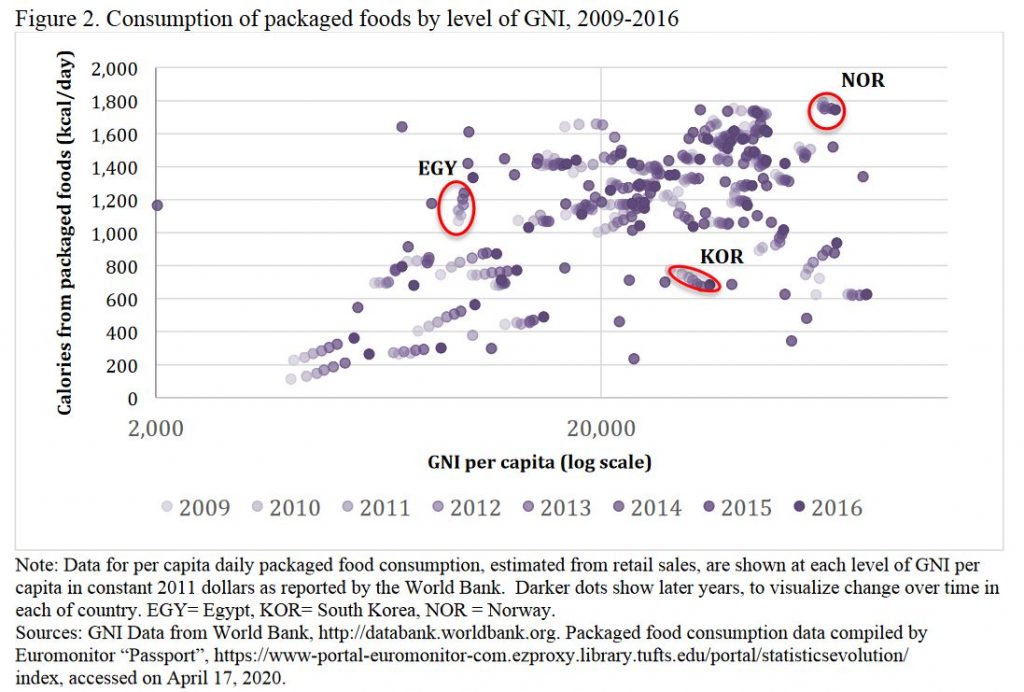
Here is a great example of the result, from weekly exercise #10 by Dana Bourne in Spring 2020 (updated from when I first posted this in 2017):

Everything about that chart should be self-explanatory, giving readers the big picture at a glance and many rich insights from deeper examination. To help improve data visualizations this blog post pulls together a few suggestions and links for convenient reference. The dataverse of available information is expanding rapidly, with increasingly sophisticated expectations as shown by the many images one gets from a google search for data visualization.
My favorite guide to data visualization for policy audiences is from the UK: https://gss.civilservice.gov.uk/policy-store/introduction-to-data-visualisation. That guide shows clearly how to feature the story told by your data in various settings. Many other sources reinforce the message about removing unnecessary ink, so the data pop out as explained in great posts about how to clear off the table and remove to improve to avoid numbo-jumbo. As with writing, it’s often best to start with a sloppy first draft then clean things up. Successful data visualizations help you tell a story, by making comparisons that highlight both similarities and differences. It’s useful and fun just to browse through the different charts presented here: http://www.ers.usda.gov/data-products/chart-gallery.aspx, and also click through https://www.ers.usda.gov/data-products/data-visualizations.
Charts and tables offer a kind of language designed to help us communicate clearly. The best charts and tables for scientific audiences are like those for policy audiences, except that you can squeeze in a bit more information. Some great advice on that is here: http://abacus.bates.edu/~ganderso/biology/resources/writing/HTWtablefigs.html. Different fields use different conventions about table or figure titles and footnotes, and have preferred visual styles for how things are presented. In general, economics and other social sciences use brief titles above the chart and detailed notes below it, while many health science readers expect a single long figure caption that combines both kinds of information. Examples from my own recent papers include one in health economics style (title and footnote), and one in health-science style (a long caption)
For oral presentation, your charts and tables should appear in ways that help you tell the story. There are many good guides to using PowerPoint effectively, of which one of my favorites is from a prominent biologist named Susan McConnell: https://www.ibiology.org/professional-development/designing-effective-scientific-presentations.
And finally, if you’re interested in guides to writing in general, my favorite is Steven Pinker’s Sense of Style — especially for his brilliant description of how all communication requires effort to overcome the curse of knowledge, in part by chunking information into digestible units which you can then bundle up into increasingly powerful stories. I look forward to seeing how you put your pieces together!
