School Affiliation: October
This past October, from the 19th to the 25th, we ran our semi-annual School Affiliation statistics again. This time around, we were able to keep it away from a major exam block, and we also grabbed the circulation data for that time to make sure we got the best picture of the week. Since it was shorter than last time, this post will be relatively quick. But hopefully you’ll still find it interesting!
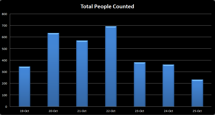
First thing is first: how many people were in the library that week? Well, we counted a total of 3,230 people that week, 695 of which were here on Wednesday alone. You can see the breakdown below.
Now, what you’re probably really wondering is how that breaks down by school, right? The answer is rather interesting. Namely, it breaks down (by floor, even!) thus:

You may notice that everyone loves the 7th floor, and that the Dental school in particular loves the ever-loving-fillings out of it. It’s worth noting that they had some exams that week, which helps explains their numbers. But what’s interesting in that graph is that you can see what kind of exams they were – the kind that required solo study (notice that the quiet floors had the majority of them). In fact, this survey seems skewed toward quieter studying. I look forward to finding out what differences there are come Spring – does April encourage more group study than October? Or was it pure chance that these number shook out this way?
Of course, what’s most fascinating is when you compare the above graph with the circulation one below, and see the full picture:
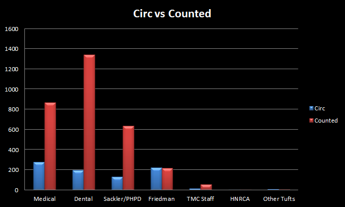
It can be a little tricky to tell due to scale there, but Medical actually checked out the most that week, followed by Nutrition, and then Dental. It seems that the Dental students were really here for the studying, not the circulation. And the Medical students were most likely checking things out and then going back to the individual study rooms or learning commons – essentially showing up on one set of statistics but not the other. Although Nutrition really made the interesting difference – the circulation number is actually higher than what we counted!
This is why the middle and bottom graphs are uneven when compared to one another – people just simply move around. The library supplies space and materials, but they don’t always get used at the same time.
That wraps it up for this time. We could, of course, look at these numbers from a dozen different directions, but maybe we can save that for the next time. After all – it’s only November.