Currently viewing the tag: "graph"
Hello hello! It’s about that time again: I’m going to fill your life with statistics and numbers and hopefully a few interesting facts, and you can enjoy it in between panicking about that paper due tonight and that exam you have tomorrow. This post will be a perfect length for you to read and then hit the bathroom before your break time is up and you need to get back to work.
So. Let’s get started!
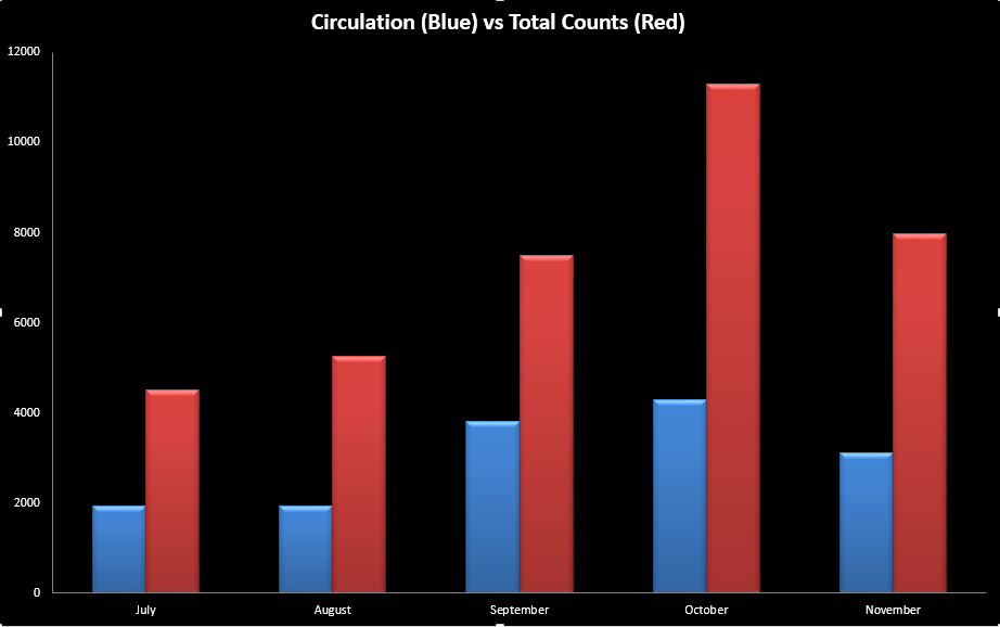
October was busy for us. Crazy busy, in fact. As you can see below, October was far and away the busiest month we had at the desk – we were just shy of 4300 checkouts! Egads. It was also the busiest month we had with our roaming statistics (which you’ve most likely seen – a staff member walking around with an iPad counting heads in the library). You may recognize these numbers as “not even close.”
“But what about the Affiliation Week?” you may ask. Well I’m glad you asked! The answer is kind of fascinating. So one thing that we strive for with this is to be as accurate as we can with what a “typical” week looks like here. As you can imagine, that is quite difficult, given the propensity of the schools to have full blocks of exams, staggered about the semester. We chose October 25th – 31st this year, since there were no exams that week, and therefore the numbers would be as least skewed as we could make them. Here’s what we saw.
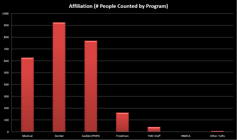
The Dental School dominated the counted programs. This is probably not a surprise to anyone, since that’s been the trend. However, what is a surprise is the combined Sackler/PHPD (which includes PA and MBS). Their numbers have absolutely skyrocketed, and now even outpace the Medical school. That’s crazy! Unfortunately, the way the Affiliation data is collected, we don’t really know how much of that would be MBS students getting ready for MCATs, or PA hanging around and studying after (or in between) classes. But it’s still awesome to see!
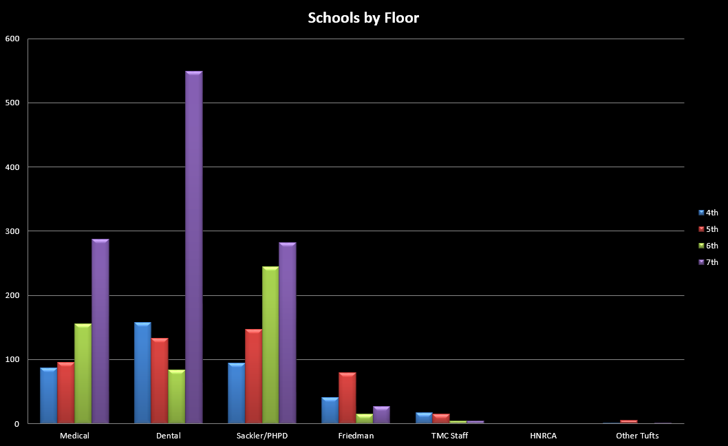
If you break it down by floor, you’ll notice everybody loves the 7th floor, because of course they do! It’s great! Tons of individual study space, and plenty of group rooms. Dental looks like if they couldn’t take the 7th, they’d stay on the 4th, but everybody else started on the 7th and then trickled downward. Well…except for Friedman. Nutrition students like the 5th floor, it looks like – possibly big fans of the collaboration rooms?
Incidentally, this past November I actually went to a library conference down in Atlanta. I don’t know if you’ve been to Atlanta, but if you go, make sure to have some local beers (many good microbreweries down there), and go check out the Georgia Aquarium! The whale sharks are insane.
Sorry, got carried away there. The reason I mention this is that all of my work with stats here at Hirsh over the years led me to presenting a poster down at the conference! I talked with people from around the country about data collection and its uses. As it turns out, your very own Hirsh Health Sciences Library is at something of a leading edge with all of this! See, the entire philosophy behind finding all these numbers out is that we want to be able to serve all of you as best as we possibly can, and every piece of information helps with that mission. I don’t tend to get too technical with these posts, but we do know (for instance) that laptops, Mac chargers, and phone chargers are the most popular items to be checked out. Books have been slipping every year as the schools push toward digitization, and the library has to be able to stay on top of that.
Well, we’re not alone! Other libraries – all libraries, really – are trying to keep up with the changing face of their patron body, and they aren’t always getting the info they need from their patrons or schools before they actually need it. So they’re starting to turn to data collection – Circulation statistics, head counts, all that stuff – in an attempt to see trends as they’re starting. I was very popular at this conference, as it turned out.
And in case you doubt my story, here’s the proof:
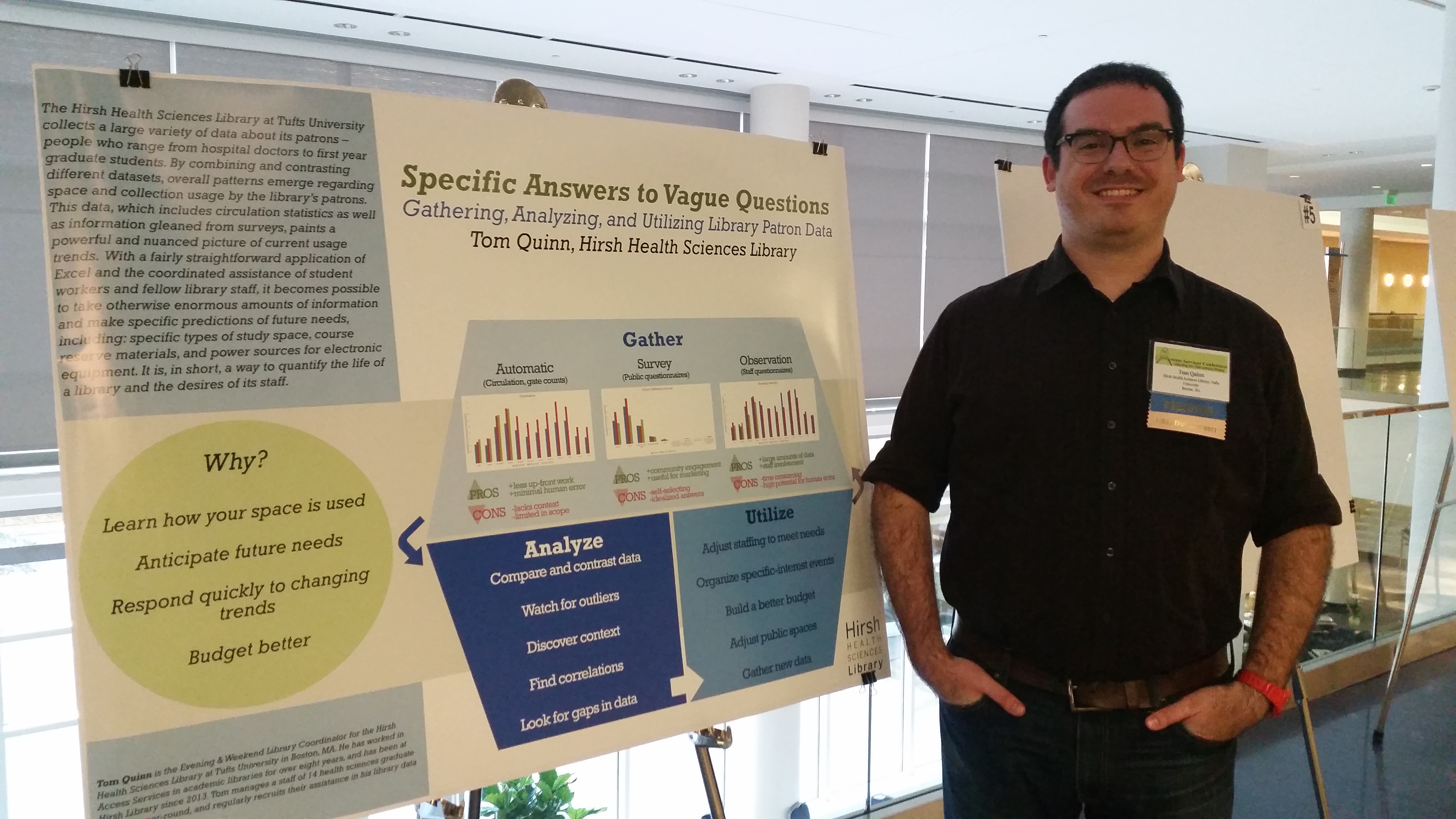
That is me, looking a combination of tired and excited, standing next to my poster (which, I’d like to note, was visually designed by the delightful Katherine Morley, Admin Coordinator for Hirsh, and head of our PR committee – so the brains behind events like our monthly crafts). The graphs on there are actual data from the library – specifically, it’s Circulation, Roaming, and Affiliation data from July 2013 through October 2015. Two and a half years of numbers, and trends, and watching our library grow and expand. I won’t lie – I was feeling pretty proud of what we do here while I was talking to people.
In the nerdiest way possible, of course.
On that note, I will leave you be. Thank you for sticking with me on this post! I truly appreciate it. Now, go hit the bathroom, get yourself some caffeine delivery system of choice, and get back to studying! I have faith that you’ll do well, but fortune favors the prepared.
Good luck with the exams, and have a good break!
Until next time,
Tom
Hello all! As you may recall, the Hirsh Library ran its biannual Affiliation Week survey back in March, which means the time has come for a blog post where I show you some of the numbers, so you can see how your school sized up against the others!
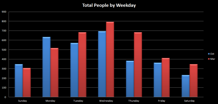
First up: how busy was the library? Well, the short answer is: crazy busy. March was overall just about one of the busiest months we’ve ever had (which is its own story for another day), and that was reflected pretty clearly in our data. For instance:, here’s how busy that week was (in terms of total people in the library):
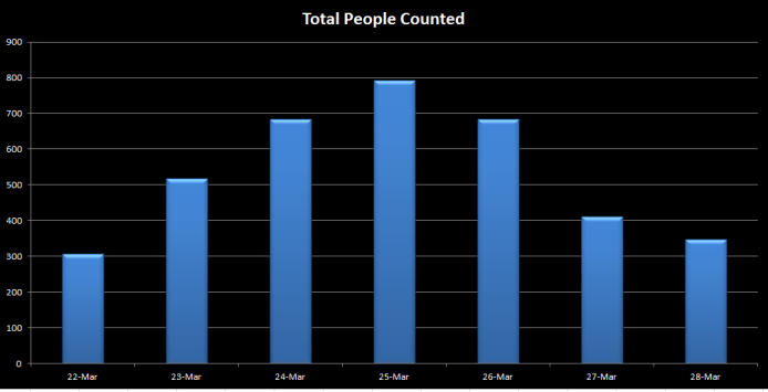
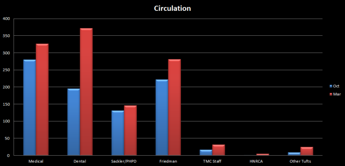
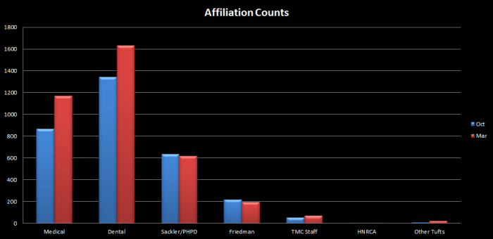
Crazy, right? We had 793 people in the library on Wednesday, March 25th. It may not be the busiest day we’ve had, but that’s still busy! But really, we’re here to talk about the schools, so try this next chart on for size. It’s the total numbers of people from each school that were counted in Circulation (checking things out) vs Affiliation (when we walked around and asked where you were from):
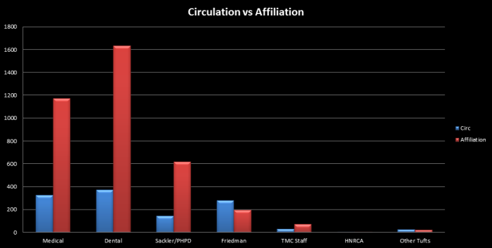
So, ah…congrats, Dental! You blew everyone away in sheer numbers of people studying in the library. The circulation race was a bit closer, though: Dental was first with 372 checkouts, but Medical was a close second with 327, and Nutrition actually came in at third with 281. Of course, this is a good time to point out that it is not actually a contest between the programs – Hirsh is here to help everyone on our Health Sciences campus, whether they show up in huge numbers in these data sets, or whether we only see a few of their members all month. It is very helpful to know how we’re getting used, though, so here we are.
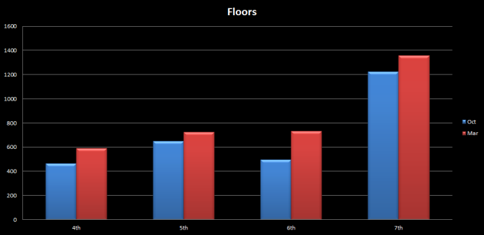
The final March chart is one of my personal favorites: the by-floor breakdown. This is where we can see how the members of the different programs spread out in the library. This is where you can see the most popular study spaces. To the surprise of absolutely nobody, it’s mainly the 7th floor:
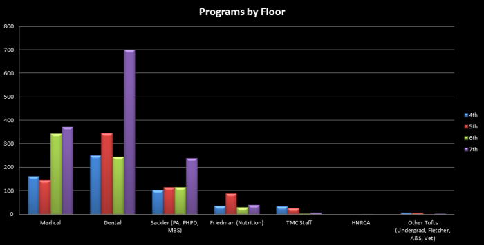
What’s really interesting here is the way it got used, though. Yes, Dental used the heck out of the 7th floor, but once you remove that outlier what you see is…remarkably homogenous. Medical broke almost even between quiet floors on one side and “noisy” floors on the other. If they weren’t on the 7th floor, the Dental students could be almost anywhere else. Sackler students (which, for this survey, includes PA, PHPD, and MBS) were again preferring the 7th, but appeared willing to show up almost anywhere with equal interest. Nutrition preferred the 5th floor, though. Perhaps due to the sheer amount of group-appropriate space on that floor?
This brings us all to the Affiliation Year-In-Review part of this post. As I said, March was crazy busy. How busy, you might ask? Well, compared to October, we had more people in the library:
We checked out more books, laptops, and chargers (especially chargers):
We had more people around to tell us what programs they were from:
And each one of our floors was used more than it had been in October. This final chart suggests that all of the construction on the 6th floor has gone to good use (that’s a jump of 236 people right there – ultimately making the 6th floor busier than the 5th by 9 people), although no matter how many classrooms we build, people will always prefer the quiet of the 7th floor for work and studying:
Thank you for reading! Once all the numbers for this academic year are in this summer, I will be putting together a look back at this past year, which has been busier than we’ve ever been (and perhaps even busier than we were expecting to be). In the meantime, if you’d like a more in-depth discussion of any of the information presented (or if you’re just interested in chatting usage or data in general), feel free to come see me at the Service Desk on Sackler 4 some weeknight! I’m always happy to talk.
Especially after being driven half-blind by Excel’s chart system.
Tom

Follow Us!


