Background
- Fall 2024
- Team Project (Group of 5)
- Skills: UI, User Research, Human Factors
- Tools: Figma
- Role: User Researcher
Overview
Prompt
Step 10 of Alcoholics Anonymous (AA) encourages individuals in recovery to continuously reflect and make amends for past actions. My Tenth Step is designed to help users engage in the practice of creating a daily inventory by providing a structured and supportive platform. Their goal is to transform self-reflection from a tedious task into an engaging and meaningful experience.
Note: Creating a daily inventory is a self-reflection process where individuals review their thoughts, actions, and behaviors, address negative patterns, and celebrate positive behavior from the day.
Goal
Our team sought to improve the app’s usability and effectiveness, particularly for newcomers, while also exploring its potential for broader audiences interested in self-reflection beyond addiction recovery.
Initial Insights
We started by downloading the My Tenth Step app ourselves to identify pain points and areas for improvement.
User Group Identification
We then identified primary and secondary user groups to expand the app’s accessibility beyond those recovering from alcoholism. The primary users include short-term and long-term AA members, as their needs differ based on their recovery stage. The secondary users include loved ones, working adults, and college students—groups that could benefit from mindfulness and self-reflection tools.
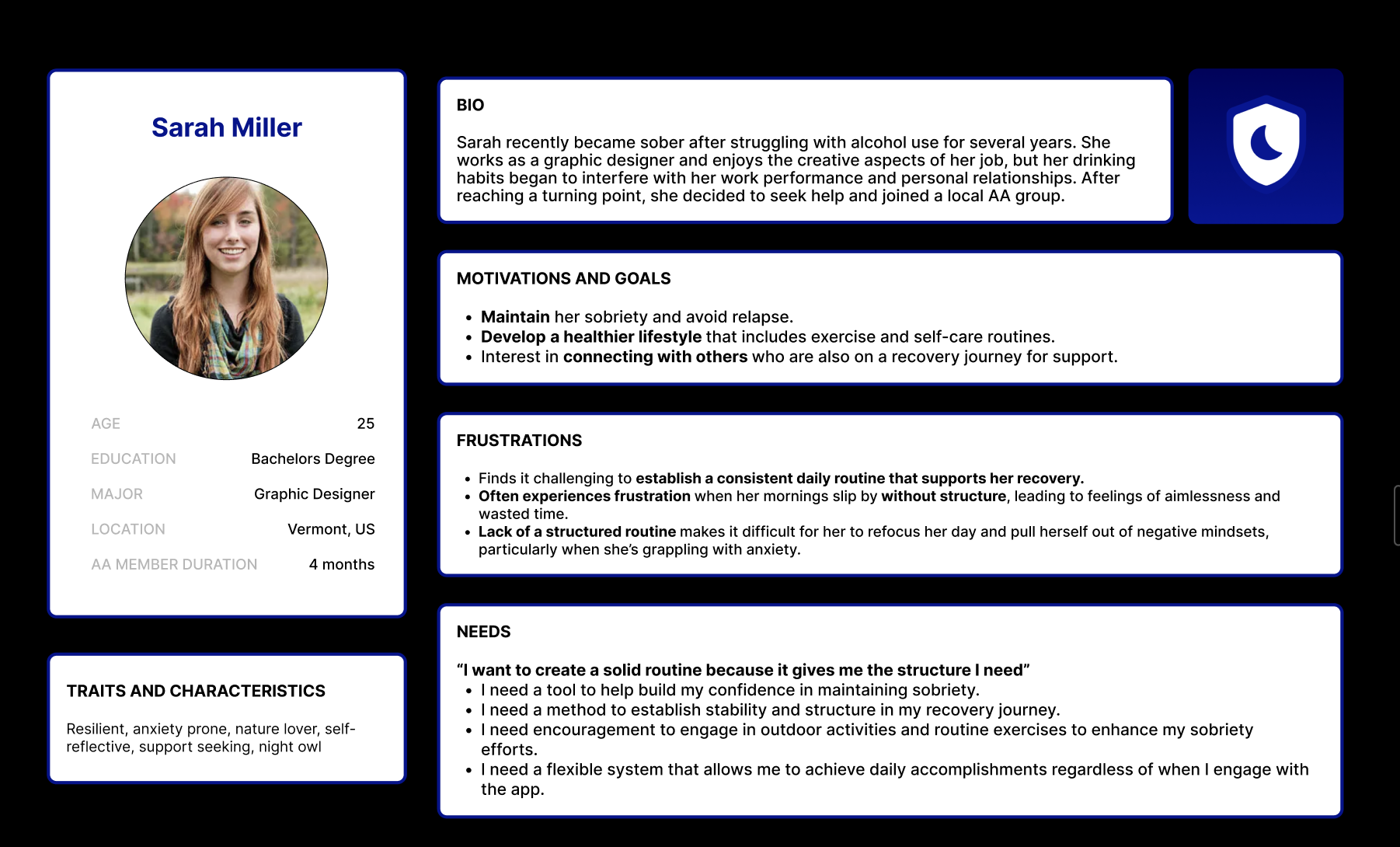
Newcomer AA Member
Using a lit review and an observational study where I attended an open AA meeting, I focused on researching the Newcomer AA Group Member. I found that Newcomers to AA, with less than a year in the program, are still building habits and adjusting to the 12-step process. They often struggle with motivation, consistency, and emotional challenges, relying on sponsors and peer support.
Key Findings & Design Insights
- High Dropout Rates: 50% leave AA within three months, and 59% within a year, highlighting the need for early support.
- Self-Efficacy & Relapse: Long-term members have more confidence in staying sober, while newcomers struggle with self-blame and unrealistic expectations.
- Structure & Routine: Walking, mindfulness, and flexibility in resetting the day help members manage emotions.
- Nature’s Role: Many find being in nature beneficial for recovery.
Design Implications: The app should offer positive reinforcement, avoid discouraging language, and incorporate nature-inspired elements to support early recovery.
Wireframing
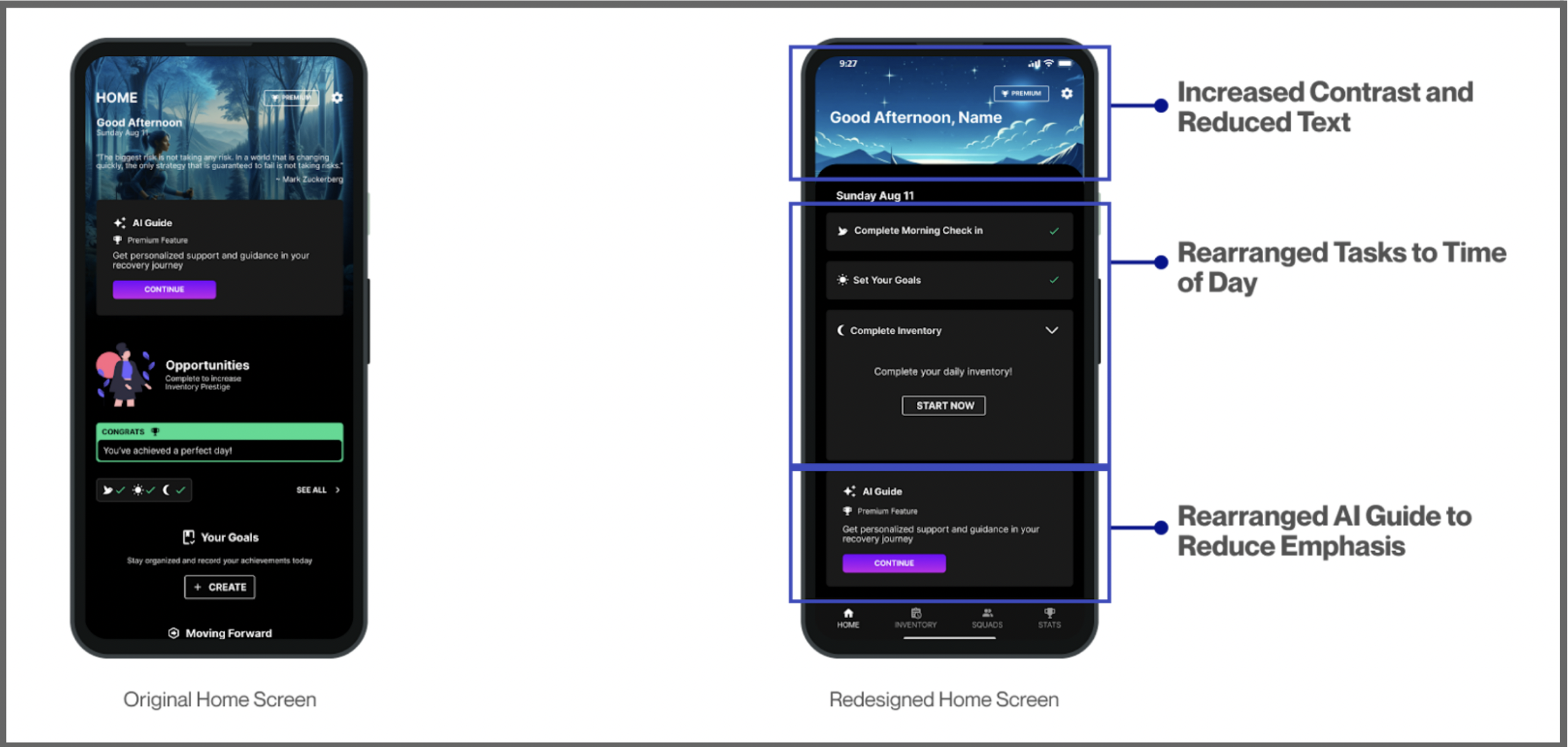
We redesigned the Home Page, Inventory Flow, and Quick Add Flow, focusing on improving clarity and usability.
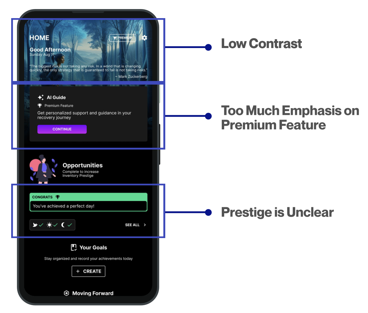
Key Issues Identified:
- Low contrast in the header reduced text readability.
- Overemphasis on the premium AI guide distracted users from their main tasks, leading to confusion.
- Lack of explanation for the gamification feature (Inventory Prestige) made it unclear how it worked.
Solutions Implemented:
- Increased contrast and reduced header text for better readability.
- Introduced three expandable task blocks, organized by the time of day, to guide users through their daily tasks.
- Moved the AI guide to the bottom to reduce distraction while still keeping it visible for engagement.
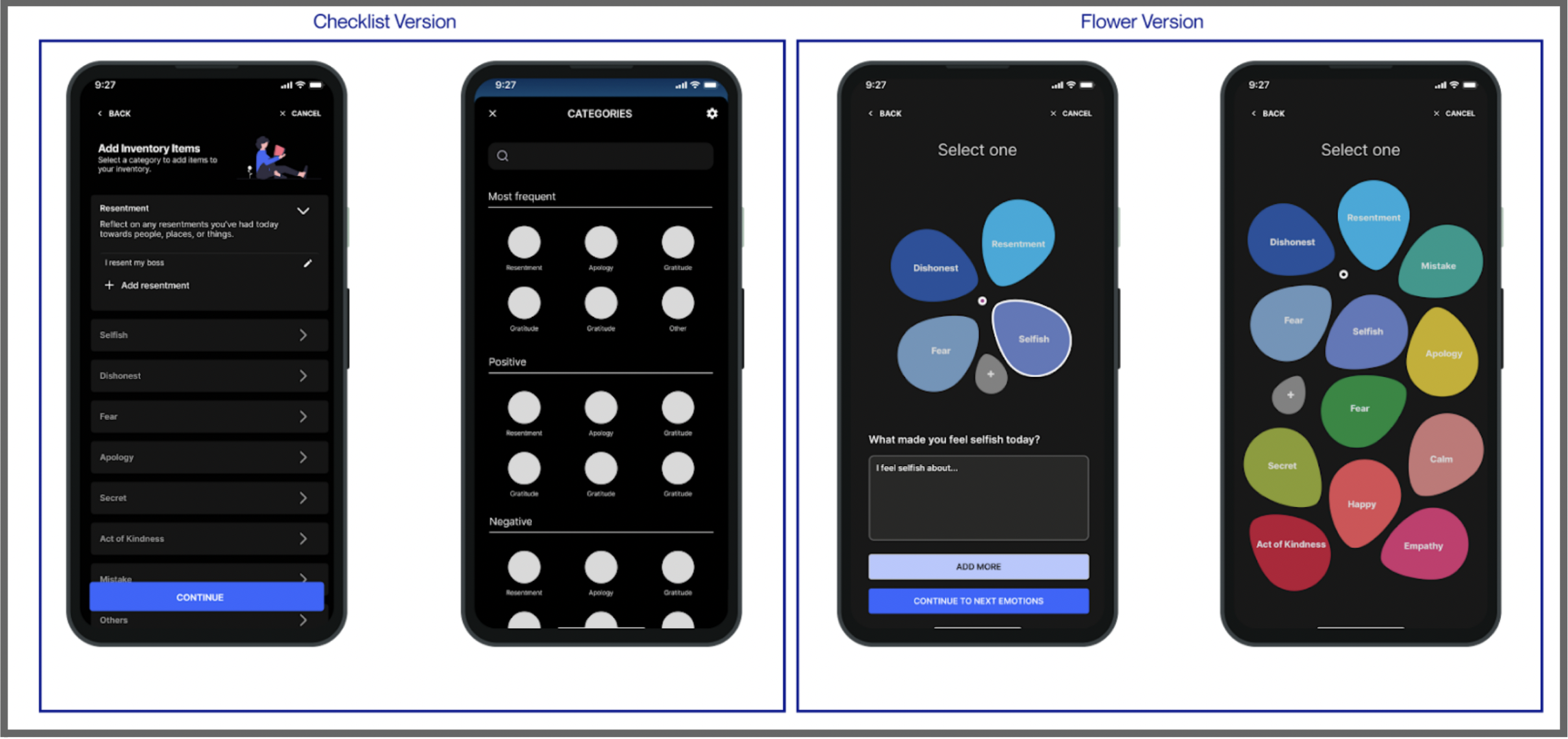
We created two design versions for the Inventory and Quick Add Flow:
- Checklist Version
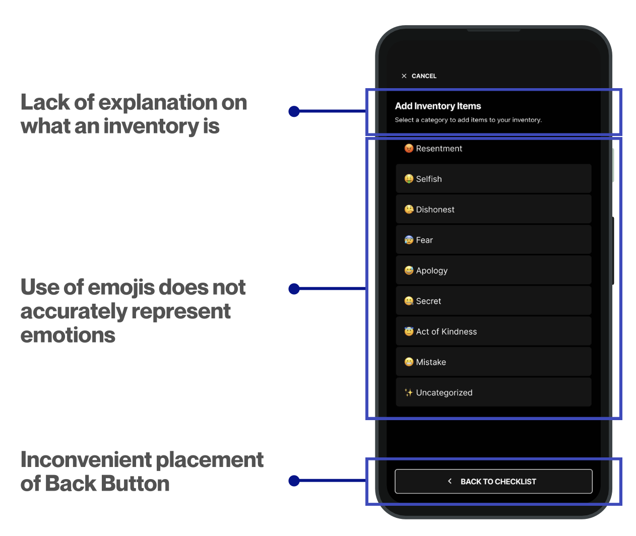
- Based on the app’s existing components for simplicity and ease of development.
- Removed emojis and categorized emotions into Most Frequent, Positive, and Negative for clarity.
- Moved the Back button to the top left and the Cancel button to the top right to reduce errors, especially for Android users.
- Flower Version
- A new, visually engaging design featuring colors and shapes inspired by flowers.
- Aligns with research on New AA members, incorporating natural elements to enhance the experience.
- Designed to make tracking emotions more enjoyable while maintaining the focus on both positive and negative emotions.
Both designs aimed to improve usability while exploring different approaches to engagement and emotional tracking.
Usability Testing
Our primary goal was to compare user preferences between two designs:
- Checklist Design – Maintained the app’s original structure.
- Flower Design – Introduced a new visual approach, using flower petals to represent emotions.
Additionally, we sought feedback on the home screen design, pain points in creating a daily inventory, and the usability of the Quick Add feature.
Hypothesis:
We expected users to prefer the flower design, as the checklist might feel like a chore, whereas the flower design gamifies the experience to improve engagement and retention. Based on our user personas, we also anticipated high usability scores, exceeding the standard System Usability Scale (SUS) threshold of 68.
Testing Process
- Introduction: Participants were given a brief overview of My Tenth Step and its purpose, including a short explanation of AA principles for those unfamiliar.
- Home Screen Feedback: Users provided initial impressions to ensure the design was intuitive.
- Task Completion: Participants were randomly assigned to view either the checklist or flower design first. They completed two tasks:
- Creating a daily inventory
- Using the Quick Add feature
- Usability Ratings: After completing tasks, participants provided:
- A SUS score
- An ease-of-use rating (1 = very easy, 5 = very difficult)
- Qualitative feedback on their experience
- Design Comparison: Users repeated the same process with the alternate design and provided feedback.
- Final Insights: The session ended with broader questions about how the app might fit into their daily mindfulness or recovery routines.
| Materials | Use |
| Figma | We used Figma for prototyping to present the new screens to users and as the platform where participants completed tasks. |
| Google Docs | A moderator guide script was prepared using Google Docs to ensure consistency across sessions. |
| Google forms | We used google forms to take notes. |
| 2 Laptops | During testing, we utilized one laptop to display the prototype and another to take notes on participant feedback. |
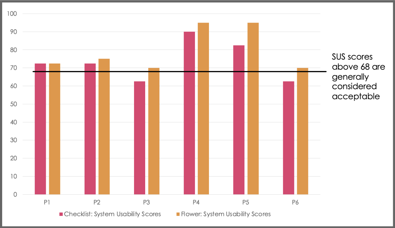
User Testing Results
- Preference: All six participants preferred the Flower version over the Checklist version, citing its engaging and gamified design.
- Usability Scores:
- Flower Version: All participants rated it 70 or higher on the System Usability Scale (SUS), exceeding the usability threshold of 68.
- Checklist Version: Four participants rated it 70 or higher, while two gave it 62.5.
- Task Performance:
- Creating a Daily Inventory: Five out of six participants found it “very easy” or “easy” in both versions.
- Quick Add Feature: All participants found it “very easy” or “easy” in the Flower version.
User results confirm that while both designs are usable, the Flower version is the preferred and more engaging option.
| Participant | Checklist Version: Task 1 Create a Daily Inventory EoU (1-5) | Flower Version: Task 1 Create a Daily Inventory EoU (1-5) | Checklist Version: Task 2 Add an Item Using Quick AddEoU (1-5) | Flower Version: Task 1 Add an Item Using Quick AddEoU (1-5) |
| P1 | 1-very easy | 2-easy | 1-very easy | 1-very easy |
| P2 | 2-easy | 2-easy | 2-easy | 1-very easy |
| P3 | 1-very easy | 3-neither easy nor difficult | 1-very easy | 2-easy |
| P4 | *4-difficult | 1-very easy | *4-difficult | 1-very easy |
| P5 | 1-very easy | 1-very easy | 1-very easy | 1-very easy |
| P6 | 2-easy | 2-easy | 1-very easy | 1-very easy |
User Testing Detailed Results
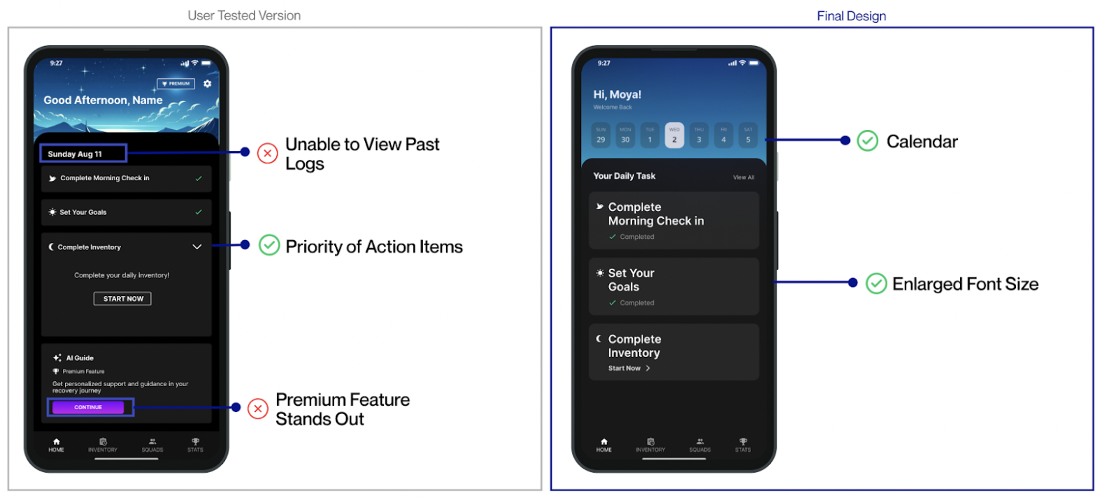
Home Page
- Past Logs: Users wanted to view previous entries, which the tested version lacked.
- Premium Feature Placement: Despite moving it to the bottom, its bright color was still distracting.
- Vertical List Format: Users liked it as it clearly prioritized action items.
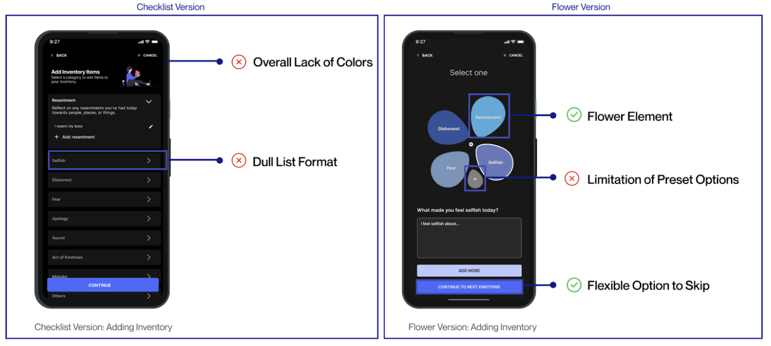
Inventory
Checklist Version
- Lack of Color: Users found it hard to determine what action to take due to minimal color emphasis.
- List Format: Felt more like a task than a reflection, which conflicted with the app’s goal.
- Main Visual Focus: The person icon was the only element that stood out.
Flower Version
- Positive Reception: Users loved the flower petal presentation, appreciating its calming, nature-inspired design.
- Mixed Feelings on Customization: While users liked the option, they disliked categorizing custom emotions and the extra effort involved.
- Gray Color Issue: Some thought the gray color suggested the feature wasn’t usable.
- Flexible Navigation: Users liked the ability to skip sections and focus on relevant emotions.
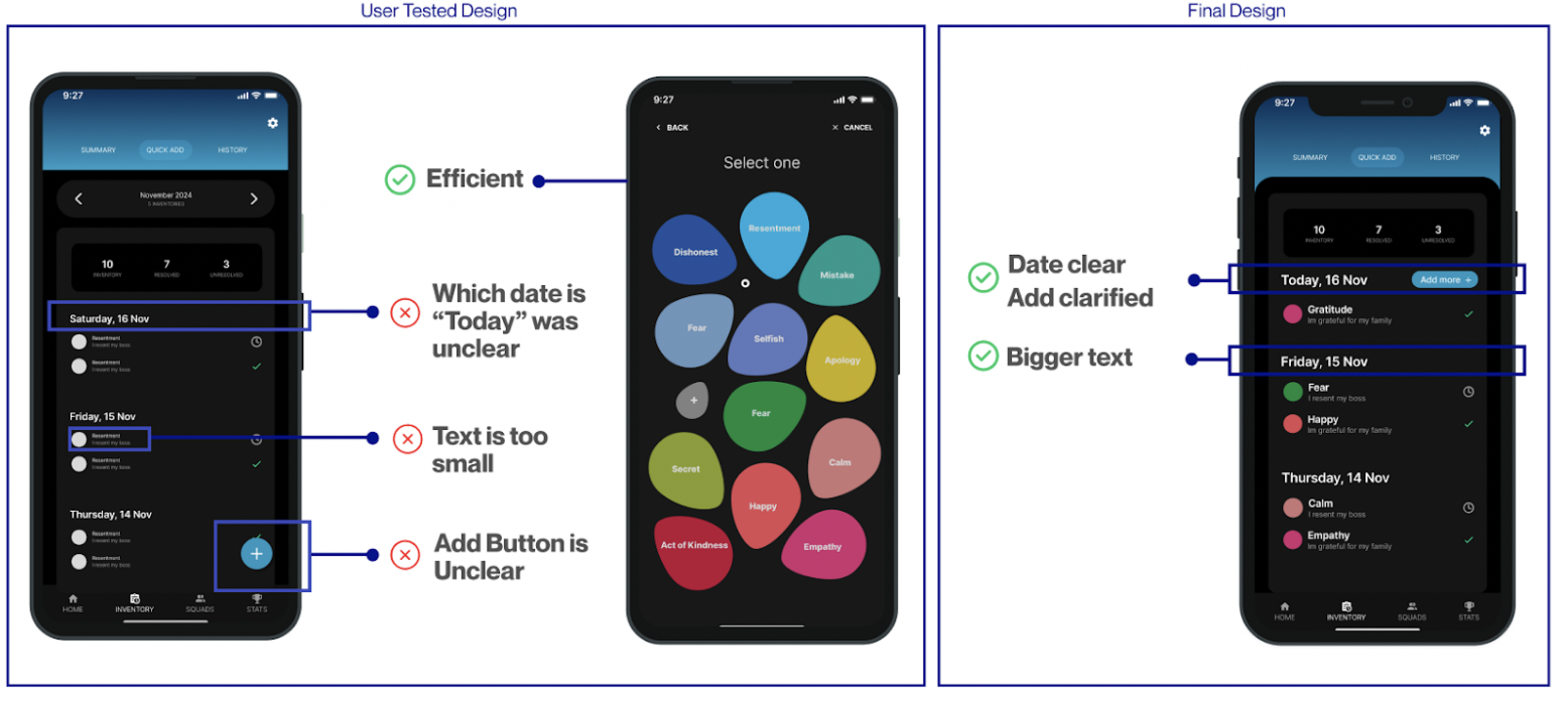
Quick Add
Positive Feedback: Users appreciated the efficiency of the Quick Add page, noting that having all emotions on one screen saved time. They also found the vibrant colors visually appealing.Areas for Improvement:
- Lack of Date Indicator: Users couldn’t tell which day was today.
- Small Text: Hard to read, posing accessibility concerns, especially for older users.
- Unclear Add Button: Users were unsure of its function and suggested moving it under today’s date for clarity.
Roadblocks and Challenges
Narrowing the Scope
At first, we struggled to define our focus since our clients gave us creative freedom. We explored many ideas but realized we couldn’t do everything in one semester. To stay on track, we prioritized three key features: the home screen, daily inventory, and quick-add function. These were the most essential to the app’s purpose and ensured our work had the most impact.
Developing the Flower Version
Creating the Flower version was challenging. We started with the Checklist version, a simple redesign of the existing app, but our clients encouraged us to not feel restrained from the original design.
Inspired by user feedback about nature themes, we redesigned the emotion display as a flower. This made the interface more engaging, intuitive, and aligned with the app’s goal of emotional reflection.
Future Directions
Our recommendations fall into two categories: enhancing support for people in recovery and expanding the app’s appeal to a broader audience.
For people in recovery, the app could go beyond daily inventory tracking by offering practical support resources. Research shows that tangible assistance is just as important as emotional support in maintaining sobriety. Partnering with external organizations could provide users with access to helpful tools, services, and community support, while also increasing the app’s reach.
To attract a wider audience, the app should emphasize that daily inventories benefit everyone, not just those in recovery. Since this feature is closely tied to the recovery process, educating potential users about its broader benefits could encourage adoption. Additionally, offering more customization options and alternative user flows would make the app more accessible and appealing to the general public.