3-D Plot Submission
Partners: Sora Johnson
Title. Ultraprocessed Food Consumption Among Cancer Survivors in NHANES (1999-2016): Trends Among Different Race/Ethnicities and Education Levels

Legend. Data is from 4527 cancer survivors in the National Health and Nutrition Examination survey, where responses include self-reported 24-hour dietary recalls, self-reported race/ethnicity, and self-reported education levels. Fill gradient, as indicated on the right side of the graph, indicates the percentage of calories from ultraprocessed foods, with the dark grey color indicating that there were no cancer survivors from that survey cycle who fit into the category. The stars indicate the release of new dietary guidelines.
3-D Plot Revision
Partners. Sora Johnson
Title. Trends in Ultra-processed Food Consumption Among Cancer Survivors in the National Health and Nutrition Examination Survey (1999-2016): Are messages in the Dietary Guidelines for Americans reaching cancer survivors?
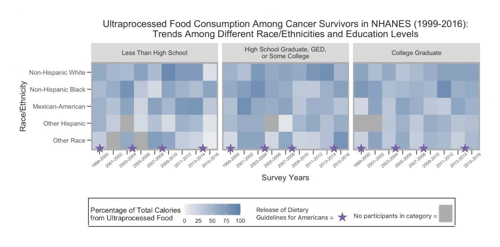
Legend. Data is from 4527 cancer survivors in the National Health and Nutrition Examination survey, where responses include self-reported 24-hour dietary recalls, self-reported race/ethnicity, and self-reported education levels. Fill gradient, as indicated on the right side of the graph, indicates the percentage of calories from ultraprocessed foods, with the dark grey color indicating that there were no cancer survivors from that survey cycle who fit into the category. The stars indicate the release of new dietary guidelines. This heatmap is paneled by education level, with the rightmost panel indicating the highest education.
Abstract
Cancer survivors have an increased risk of developing chronic comorbidities due to the toxicity of the treatments they receive [1]. A survivor’s diet is a modifiable life factor known to prevent many of these comorbidities [2-4]. The consumption of ultraprocessed foods is thus of concern, since these foods are high in unhealthy fats, refined starches, sugars, and salt, and low in dietary fibers and micronutrients. [5]. We used dietary data from the National Health and Nutrition Examination Survey (1999-2016) to examine ultraprocessed food consumption among cancer survivors of different race/ethnicities and education levels. Despite the release of several dietary guidelines addressing the detrimental properties of ultraprocessed foods, there were few discernable patterns even when considering these sociodemographic factors. Our work highlights the limited impact of dietary guidelines among cancer survivors, emphasizing the need to develop and evaluate more targeted intervention programs in this vulnerable group.
1. American Cancer Society. Long-Term Side Effects of Cancer. Secondary Long-Term Side Effects of Cancer 2022. https://www.cancer.org/treatment/survivorship-during-and-after-treatment/long-term-health-concerns/long-term-side-effects-of-cancer.html.
2. Van Blarigan EL, Fuchs CS, Niedzwiecki D, et al. Association of Survival With Adherence to the American Cancer Society Nutrition and Physical Activity Guidelines for Cancer Survivors After Colon Cancer Diagnosis: The CALGB 89803/Alliance Trial. JAMA Oncol 2018;4(6):783-90 doi: 10.1001/jamaoncol.2018.0126.
3. Hurtado-Barroso S, Trius-Soler M, Lamuela-Raventós RM, Zamora-Ros R. Vegetable and Fruit Consumption and Prognosis Among Cancer Survivors: A Systematic Review and Meta-Analysis of Cohort Studies. Adv Nutr 2020;11(6):1569-82 doi: 10.1093/advances/nmaa082.
4. Schwedhelm C, Boeing H, Hoffmann G, Aleksandrova K, Schwingshackl L. Effect of diet on mortality and cancer recurrence among cancer survivors: a systematic review and meta-analysis of cohort studies. Nutr Rev 2016;74(12):737-48 doi: 10.1093/nutrit/nuw045.
5. Monteiro CA, Cannon G, Moubarac J-C, Levy RB, Louzada MLC, Jaime PC. The UN Decade of Nutrition, the NOVA food classification and the trouble with ultra-processing. Public Health Nutrition 2018;21(1):5-17 doi: 10.1017/s1368980017000234.
Abstract
Cancer survivors have an increased risk of developing chronic comorbidities due to the toxicity of the treatments they receive [1]. A survivor’s diet is a modifiable life factor known to prevent many of these comorbidities [2-4]. The consumption of ultraprocessed foods is thus of concern, since these foods are high in unhealthy fats, refined starches, sugars, and salt, and low in dietary fibers and micronutrients [5]. We used dietary data from the National Health and Nutrition Examination Survey (1999-2016) to examine ultraprocessed food consumption among cancer survivors of different race/ethnicities and education levels. Despite the release of several dietary guidelines addressing the detrimental properties of ultraprocessed foods, there were few discernable patterns even when considering these sociodemographic factors. Our work highlights the limited impact of dietary guidelines among cancer survivors of all backgrounds, emphasizing the need to develop and evaluate more targeted intervention programs in this vulnerable group.
1.American Cancer Society. Long-Term Side Effects of Cancer. Secondary Long-Term Side Effects of Cancer 2022. https://www.cancer.org/treatment/survivorship-during-and-after-treatment/long-term-health-concerns/long-term-side-effects-of-cancer.html.
2. Van Blarigan EL, Fuchs CS, Niedzwiecki D, et al. Association of Survival With Adherence to the American Cancer Society Nutrition and Physical Activity Guidelines for Cancer Survivors After Colon Cancer Diagnosis: The CALGB 89803/Alliance Trial. JAMA Oncol 2018;4(6):783-90 doi: 10.1001/jamaoncol.2018.0126.
3. Hurtado-Barroso S, Trius-Soler M, Lamuela-Raventós RM, Zamora-Ros R. Vegetable and Fruit Consumption and Prognosis Among Cancer Survivors: A Systematic Review and Meta-Analysis of Cohort Studies. Adv Nutr 2020;11(6):1569-82 doi: 10.1093/advances/nmaa082.
4. Schwedhelm C, Boeing H, Hoffmann G, Aleksandrova K, Schwingshackl L. Effect of diet on mortality and cancer recurrence among cancer survivors: a systematic review and meta-analysis of cohort studies. Nutr Rev 2016;74(12):737-48 doi: 10.1093/nutrit/nuw045.
5. Monteiro CA, Cannon G, Moubarac J-C, Levy RB, Louzada MLC, Jaime PC. The UN Decade of Nutrition, the NOVA food classification and the trouble with ultra-processing. Public Health Nutrition 2018;21(1):5-17 doi: 10.1017/s1368980017000234
Keywords
cancer survivors; dietary guidelines; NHANES; education; race/ethnicity; ultraprocessed foods
Keywords
cancer survivors; dietary guidelines; NHANES; ultraprocessed foods; sociodemographics; diet disparities
Highlights
- Our research on ultraprocessed food intake among cancer survivors, across different education, race/ethnicities and years, shows little change over time
- Are Dietary Guidelines actually impacting those vulnerable to a poor diet? Our research on ultraprocessed food intake among cancer survivors suggests they are not.
Highlights
- Our research on ultraprocessed food intake among cancer survivors, across different education, race/ethnicities and years, shows little change over time.
- Are Dietary Guidelines actually impacting those vulnerable to a poor diet? Our research on ultraprocessed food intake among cancer survivors suggests they are not.
Visual Brief
Why aren’t the Dietary Guidelines for Americans impacting the diets of cancer survivors? Diet is especially important in this population, given the toxicity of radiation and chemotherapy and the known protective effects of a healthy diet. Ultraprocessed foods are high in unhealthy fats, refined starches, sugars, and salt, and low in dietary fibers and micronutrients. Despite this, the consumption of these foods has varied widely over time among different education levels and ethnicities, with some groups consuming more than 50% of their daily calories from these sources and other consuming less than 25%. We utilized data from the National Health and Nutrition Examination Survey (1999-2016) to examine average ultraprocessed food consumption over time among cancer survivors (n=4527). We further broke down our results by cycle year to show trends relative to different dietary guideline releases, as well as by race/ethnicity and education. Dietary data was collected from self-reported 24-hour recalls, and all demographic information was self-reported.
This paneled heatmap was created to better visualize potential patterns and trends of ultraprocessed food consumption over a seventeen-year time period, with visual markers (purple stars) representing the approximate release of new iterations of the Dietary Guidelines For Americans. A heatmap was chosen for this visual because it allowed for the comparison of three different categorical variables, after paneling by education level. The heatmaps were arranged with a common y axis of race/ethnicity, to allow for easy visual comparison of this race/ethnicities not only across cycle year but also by education level. The percentage of total calories from ultraprocessed foods was chosen as the fill color for the heatmap, due to the continuous nature of the variable and the ability to visualize subtle differences in consumption percentages among the groups.
While the proportion of total calories from ultraprocessed food consumption remained relatively high in many groups, those with a college education or above appeared to consume slightly less than the lower education levels, except among Non-Hispanic Blacks. Other than this subtle difference, no other patterns or trends are apparent among different groups. This was despite the release of several new dietary guidelines addressing components of ultraprocessed foods like unhealthy fats, sugars, and salt. Limitations of this study include the self-reported nature of the data, as well as a lack of consideration of other confounders that might affect diet access and quality. Future research on ultraprocessed food intake trends should consider analyzing other socioeconomic indicator variables, such as household income and nutrition security. Other visualizations of NHANES data should consider adding additional panels of these other socioeconomic factors, including different groupings of the variables to better identify potential trends and patterns. However, our research still highlights the limited impact of the dietary guidelines on the cancer survivor population, emphasizing the need to develop and evaluate more targeted intervention programs in this vulnerable group.
Visual Brief
Why aren’t the Dietary Guidelines for Americans impacting the diets of cancer survivors? Diet is especially important in this population, given the toxicity of radiation and chemotherapy and the known protective effects of a healthy diet. [1-4] Ultraprocessed foods are high in unhealthy fats, refined starches, sugars, and salt, and low in dietary fibers and micronutrients: in other words, poor dietary choices for this group. [5] Despite this, the consumption of these foods has varied widely over time among different education levels and ethnicities, with some groups consuming more than 50% of their daily calories from these sources and others consuming less than 25%. We utilized data from years 1999-2016 in the National Health and Nutrition Examination Survey (NHANES), examining average ultraprocessed food consumption over time among cancer survivors (n=4527). We further broke down our results by cycle year to show trends relative to different dietary guideline releases, as well as by race/ethnicity and education. Dietary data was collected from self-reported 24-hour recalls, and all demographic information was self-reported. Data was weighted according to NHANES analytic guidelines so that visual results were representative of the United States population at the time of each survey.
This paneled heatmap was created to better visualize potential patterns and trends of ultraprocessed food consumption over a seventeen-year time period, with visual markers (purple stars) representing the approximate release of new iterations of the Dietary Guidelines for Americans. A heatmap was chosen for this visual because it allowed for the comparison of three different categorical variables, after paneling by education level. The heatmaps were arranged with a common y axis of race/ethnicity, to allow for easy visual comparison of this race/ethnicities not only across cycle year but also by education level. The percentage of total calories from ultraprocessed foods was chosen as the fill color for the heatmap, due to the continuous nature of the variable and the ability to visualize subtle differences in consumption percentages among the groups.
There were more disparities in ultraprocessed food consumption within the lower education categories, as visualized by the larger gradient distinctions in the left and middle panels compared to the right panel. Other than this, no other patterns or trends are apparent among different groups or over time. This was despite the release of several new dietary guidelines addressing components of ultraprocessed foods like unhealthy fats, sugars, and salt. Limitations of this study include the self-reported nature of the data, as well as a lack of consideration of other confounders that might affect diet access and quality. Future research on ultraprocessed food intake trends should consider analyzing other socioeconomic indicator variables, such as nutrition security. Further visualizations of NHANES data should consider adding additional panels of other socioeconomic factors, including different groupings of the variables to better identify potential trends and patterns. However, our research still highlights the limited impact of the dietary guidelines the cancer survivor population, emphasizing the need to develop and evaluate more targeted intervention programs in this vulnerable group.
Peer Feedback Review
When providing feedback on your partner’s initial submission, please comment on ways the visual can be improved with respect to the 4 E’s. Keep your responses to 1-2 sentences per principle. Use the template shown here to structure your feedback, which should be posted as a comment below.
Feedback Giver Name: Please enter your name here.
• Evidence: Please enter your comment here.
• Efficiency: Please enter your comment here.
• Emphasis: Please enter your comment here.
• Ethics Please enter your comment here.
Self Reflection
Please reflect on what revisions you have made to your visual and abstract. Respond to the following questions regarding questions you have made in 1-2 sentences each. Use the template shown here to structure your feedback, which should be posted as a comment below.
• What changes did you make when revising your visual?
Based on feedback I received, I added new sections to my legend that described what the purple stars and dark grey boxes referred to, rather than just writing this in the text legend; I moved all of the legend pieces to the bottom of the graph for an easier viewing experience. I also clarified my title to better emphasize the take-home message of my graph, in addition to utilizing only weighted NHANES data to create this visual. Finally, I reorganized/recoded the race/ethnicities on my y axis.
• What changes did you make when revising your visual brief?
I added a section to the text where I noted that the data graphed was weighted, so that the visual would be nationally representative of each time period where the data was collected.
Evidence: The data source is clearly stated in the figure legend and again in both the abstract and the visual brief; NHANES is a reliable source of data and the addition of the method of data collection (it being self-reported data) is a great improvement. I also like that instead of stating “cycles”, the time variable is presented as a period of time which is more intuitive in terms of understanding longitudinal data.
Efficiency: As I generally find it difficult to understand/distill the message of heat graphs (unless there is a very clear gradient), this type of graph is a bit harder to follow and read. I was not able to really identify a significant trend between education level and race/ethnicity as outlined in the visual brief, however, I do think emphasizing the lack of an obvious trend is well done in your visual brief. The explanations in the legend for how each category is displayed in terms of color and line type is clear and easy to understand; it may increase understanding to add an embedded legend into the graphic itself to label the stars and the grey rectangles in addition to the written explanation in the legend.
Emphasis: The legend and the abstract provided clear explanations of the main message to be identified in the graphic. I like the title as well–it’s clear and concise. One suggestion (to make the graphic more clear) which would decrease the concise part of the title is to add a short statement that describes the main message of the graph. That would increase the clarity of your emphasis. One thing I think is done well in terms of color is using a different color (grey) to indicate the missing data instead of white, as white is part of your scale for % calories from UPFs.
Ethics: The message of this graphic is definitely something that would be appropriate in the policy-making or nutrition communications space, (i.e., an expert or professional in the health care/policy space). I would also argue that the heatmap type of graph is more apprpriate for an expert or someone with experience reading graphics as it’s not as intuitive as some other types of graphs. The visual provides an in-depth explanation of not only how understand the graph/main message, but also why it’s important in the greater context of this field of research.
Great graphic!