My one-slide picture of the U.S. food system, as seen through price changes over time
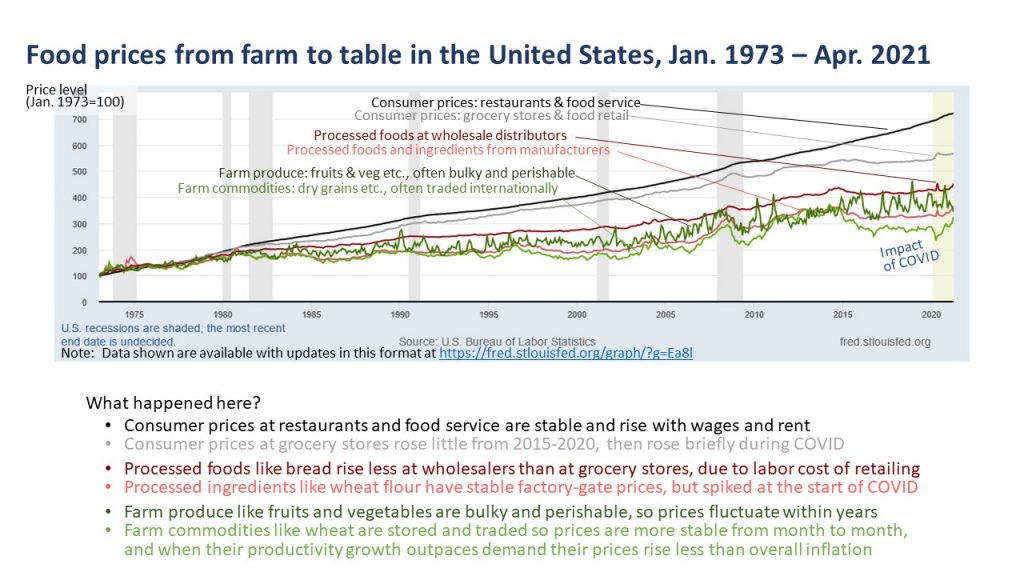
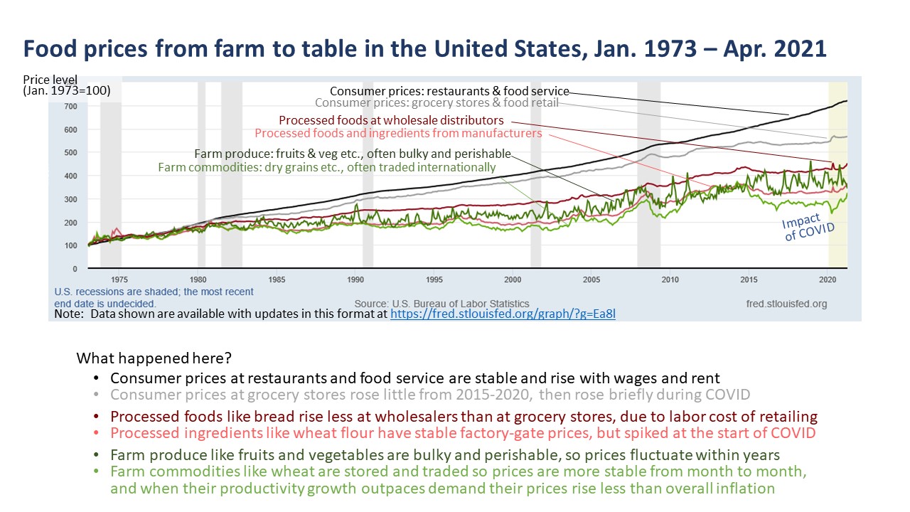
I just updated my favorite one-slide picture of change since the early 1970s:

You may want to click on the image to enlarge it — or go directly to see the latest data in this format at https://fred.stlouisfed.org/graph/?g=Ea8l.
This is a useful chart for teaching, to explain price formation at each stage of supply from farm to table, and the ladder of diet costs from just enough calories to nutrient adequacy and an overall healthy diet that we’re studying in our work on Food Prices for Nutrition. That project focuses on lower income countries, but using U.S. data can be helpful to see how food systems change over the long run as in the patterns shown above.

