Thanks to all of our competitors, speakers, organizers, and judges for a great event!
Check out the “Winners” tab to see videos of our top entries.

Thanks to all of our competitors, speakers, organizers, and judges for a great event!
Check out the “Winners” tab to see videos of our top entries.
We are so excited to get launch VizAthon2021: Disrupting Childhood Obesity this Friday January 8th. We will host the kickoff event at 1:00 PM EST via Zoom. This event will include guest speakers in addition to an overview of the event challenge. The Zoom link will be sent out on Friday morning via email to all registered participants.
As a reminder, the grand prize winning team will receive $600 (up to $150 per person) and three runner up teams will win $300 (up to $100 per person). If you have any friends you want on your team, tell them to register before Friday: https:tinyurl.com/y5mld5u8.
We have published the initial list of workshops: https://sites.tufts.edu/vizathon/vizathon-schedule/ . Get excited to learn new skills and hear from data visualization and health experts.
Each day during the competition you will receive an email with the zoom links to the upcoming events. All workshops will be recorded and hosted in a box folder accessible via your Tufts log-in.
Looking forward to seeing all of you this Friday,
The VizAthon Organizers
Author: Karin Knudson Date: 12/8/2020
Find meaning in data
Recent years have seen an explosion in the amount of data that is collected and stored. However, just having raw data often does not immediately teach us anything (think about how hard it is to quickly extract meaning from looking at a huge table of numbers, for example). By exploring data graphically, we can bring the powerful pattern-finding abilities of our visual system to bear in identifying properties of the data that may warrant additional investigation: trends, clusters, outliers, data quality issues, and other patterns. The process of moving from new data to increased knowledge is a complex one, and data visualization is one of our essential tools for beginning to see what a data set might be able to tell us.
Tell a story
While we may make exploratory data visualizations for just ourselves, typically the purpose of a data visualization is to communicate with others. In creating a data visualization, we choose which aspects of the data to highlight, and which patterns to emphasize. We make choices about the content, form, and design of the visual that can totally change what a viewer gets from it. Importantly, as we learn more about data visualization, we make better choices. Many visuals can tell a story, but the right visualization can make the story clearer, more accurate, and more memorable to its audience.
Make positive change
Data visualizations can be used both to persuade and to inform. In either context, they are a powerful complement to a verbal narrative. Data visualization is used extensively in science, the media, education, government business, and just about any field you can imagine. In all of these areas, effective use of data visualization can help in making practical decisions that are informed by data.
Understand the limitations
Whether you decide to be a creator of data visualizations or not, you are almost certain to be a consumer of data visualizations. Data visualizations are a highly effective means of communicating about data, but they have important limitations. Creating a data visualization involves many, many choices – inevitably the person who makes a visualization highlights some aspects of the data and suppresses others. These choices can be a valid part of the storytelling mechanism, or they can be made in ways that distort or mislead. Data visualizations can be poor visualizations in many ways: they can be misleading, wrong, based on inadequate data, or just hopelessly unclear. In a world where figures and charts from data are used constantly to illustrate, advocate, and argue, being an informed participant requires the ability to evaluate a data visualization, and to notice when data is being presented in a way that distorts, misleads, or lies.
More Information:
The following books give excellent introductions to data visualization and principles of how to do it well:
The Truthful Art: Data, Charts, and Maps for Communication, by Alberto Cairo
How Charts Lie: Getting Smarter about Visual Information, by Alberto Cairo
Fundamentals of Data Visualization: A Primer on Making Informative and Compelling Figures, by Claus Wilke
The Visual Display of Quantitative Information, by Edward Tufte.
A VizAthon is a hackathon-style event where teams will work over a period of a few hours to a few days to create data visualizations, usually around a certain topic.
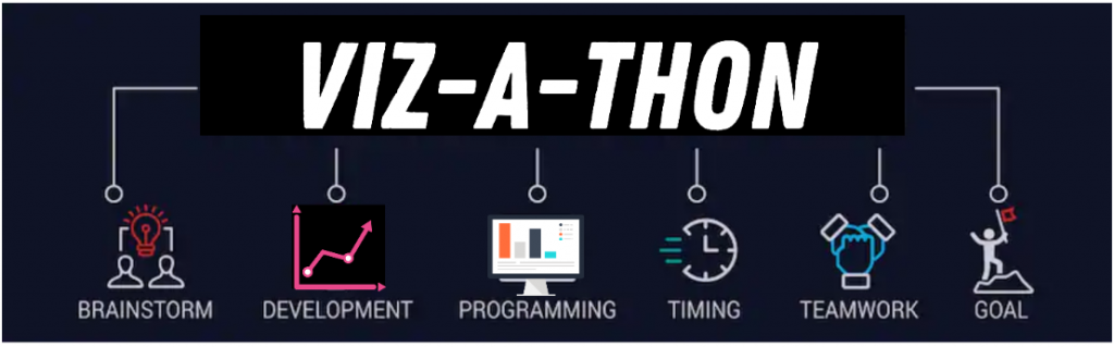
In this case, the topic is childhood obesity and related factors. At our event, you will learn from experts at the Friedman School and community partners to better understand how data visualizations can help community organizations work more effectively. You will hear from data science experts to learn visualizing techniques and new software skills.