Welcome to the teaching blog and resource page for Food Economics: Agriculture, Nutrition and Health, an open-access textbook published in May 2024 from Palgrave MacMillan. The site is maintained by Will Masters and Amelia Finaret, building on their courses at Tufts University’s Friedman School of Nutrition Science and Policy and Amelia’s teaching at Allegheny College. You can see recent and past blog posts by clicking on the category of interest in the menu which appears at the bottom of this page on phones, and on computers is at the top right of this page here ==>
This site will soon have password-protected links to slides, exercise prompts, past exams and answer keys. For now we invite you to subscribe to our elist so that you can receive and share updates related to the book. You can also flip through our introductory slide deck about the book, or watch/listen to the podcast interviews below about why we wrote it and what the book offers for readers from a variety of backgrounds.
The book is aimed at advanced undergrads, graduate students and general readers with a professional or personal interest in the topic. The first half is a gentle introduction to economic principles using food-related examples, and the second half explains how food systems work using tables and charts with links to authoritative sources of updated data. An explanation of the book’s style and purpose is here:
Finaret, A.B. and W.A. Masters, 2025. Food economics: Teaching for the future of agriculture, nutrition, and health. Applied Economic Perspectives and Policy. (If your institution does not subscribe, click here for a preprint.)
Other than data sources the book does not cite references, because it builds directly on our massive Handbook chapter with about 300 citations to recent literature:
Masters, W.A., A.B. Finaret and S.A. Block, 2022. The Economics of Malnutrition: Dietary Transition and Food System Transformation. Handbook of Agricultural Economics, vol. 6: 4997-5083. Amsterdam: Elsevier. (If your institution does not subscribe, click here for preprint.)
In the book’s first five months since publication, it has been accessed by over 10,00 unique users from 156 countries. Outreach efforts have included symposium sessions about teaching at the AAEA in New Orleans on July 30th 2024, at the ICAE in Delhi on August 6th (using these slides), and a session at the ASSA in San Francisco on January 3rd 2025. We’ve also done a few fun podcast discussions of the book:
Norbert Wilson’s Leading Voices in Food podcast
(16 min)
VoxDev’s Development Economics podcast
(30 min.)
Anotida Chikumbu’s Book Series podcast
(51 min.)
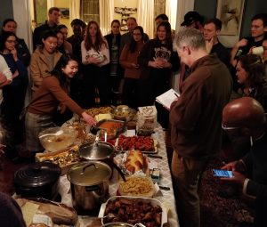
Visitors interested in the textbook authors’ own ongoing research you can visit the personal websites for co-authors Will Masters and Amelia Finaret, including Will’s Food Prices for Nutrition project that measure food access globally using least-cost healthy diets, as in the class exercise described here. The book mostly builds on our teaching, starting with Will’s food economics course at Tufts that is taught in the spring as described in the syllabus for NUTR 238, and in the fall as described in the syllabus for NUTB 238. The fall version is taught online with a short residency (hence NUTB, for blended learning). Both semesters have similar content, which is designed to be attractive and accessible to students with zero previous experience or interest in economics, while providing depth on agriculture, food markets & nutrition for those with experience in general economics.
Students can enroll individually in standalone courses like this one via Courses@Tufts. To see what it’s like, you are welcome to check out the most recent course evaluation (Spring 2025) or the history of earlier evals for Spring 2020, 2021, 2022, 2023 and 2024, as well as the evals for the online version in Fall 2020, 2021, 2022 & 2024 (skipping 2023 that was taught by Amelia Finaret).
Beyond this one course the Friedman School has an exceptionally strong and diverse collection of faculty, staff and students interested in all aspects of human nutrition, agriculture and food – all on our website — and Allegheny is among the few small liberal arts colleges to bridge into the health professions with a strong program in global health studies. Check it out!
— Will Masters and Amelia Finaret
http://sites.tufts.edu/willmasters | https://amelia.finaret.net
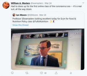
PS, like everyone else we are in hybrid mode, meeting in person as often as possible but now we’re also happy to meet online, which we take seriously as in our first class after lockdown in 2020