For scientists and climate activists who think about transportation and the climate emergency, the graphics produced by Barry Saxifrage for his website Visual Carbon and for the National Observer are a delight.
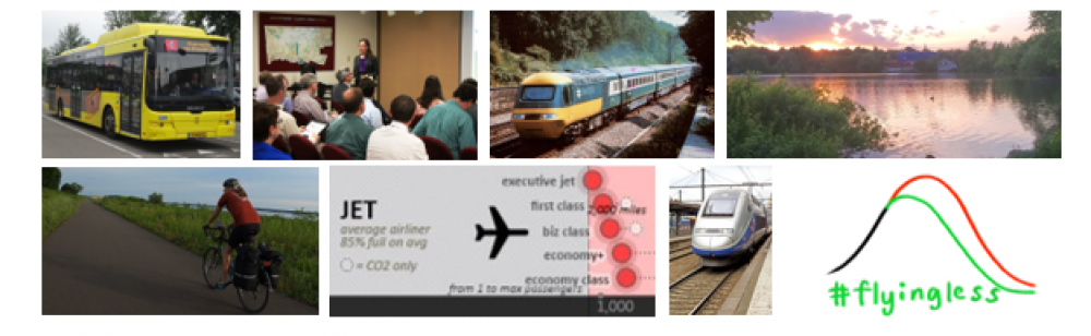
One of my favorites for many years has been his comparison of greenhouse gas emissions per mile (or per km) for different transportation modes. Late last year, I asked Barry about train estimates in particular, because Amtrak is electrified in the northeast where most Amtrak trips take place, while the carrier uses diesel on long-distance routes elsewhere. Kindly, Barry has revised his graphic to include this distinction, while also updating the numbers. Truly committed to climate action, he freely shared the updated charts this week.
Let me briefly list some of the unique features for readers who study this issue closely: (1) he clearly shows the heavy emissions from flying, (2) he includes a factor for non-CO2 impact of flying (in red circles), but he also provides alternate estimates for readers who prefer to exclude this radiative forcing factor for consistent comparison across modes (in clear circles), (3) he shows emissions per mile on the ruler at bottom or alternatively miles per ton of emissions on the ruler at top, (4) he provides green, yellow, and red color coding to make it easy to see which modes are most harmful, (5) he shows how automobile emissions per passenger mile depend on the number of passengers, which is a common source of confusion in comparisons across modes, (6) he has tiers for fossil fuel vehicles and electric vehicles, which focuses our attention on the critical climate action strategies of rapid electrification and rapid greening of the electric grid, (7) most importantly for this field of science communication, he has a thorough data footnote.
Due to data limitations, Barry had to exclude embedded emissions for vehicle production, but he applied this approach consistently across modes.
The chart helps for understanding a major theme of our #flyingless initiative:
For institutions and individuals, an initiative to reduce flying will have two important effects: (1) it will reduce miles traveled and (2) it will reduce emissions per mile with almost all mode substitutions.
You can download the full graphic in miles and kilometers formats. I hope this graphic is widely shared on social media when there is a muddled discussion of how flying compares to other modes of transportation.
