Exploring ideas and engaging in conversation

Category: Museums Gone Viral (Page 1 of 2)

What’s With All the Gay Penguins?

Ronnie and Reggie, two Humboldt penguins at ZSL London Zoo.

Over and over again, zoos and aquariums around the world are making headlines for their same-sex penguin couplings. One of the most iconic couples was Roy and Silo, two male chinstrap penguins who began performing mating rituals at the Central Park Zoo in 1998. After successfully incubating a rock and then a dummy egg, zookeepers decided to give the loving couple a real, fertilized egg. Roy and Silo hatched a baby, a female penguin named Tango. Tango then grew up to form a partnership with another female penguin named Tanuzi.

Skipper and Ping, two king penguins at Zoo Berlin.

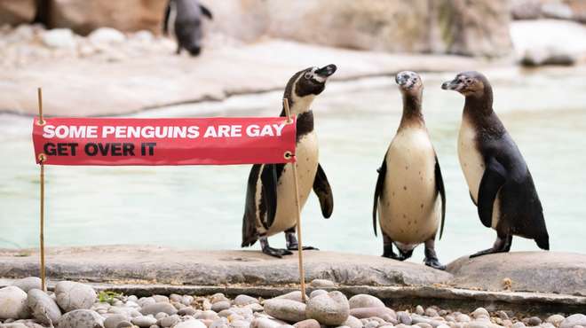
The list of gay penguin couples goes on and on and spans a wide range of species. Harry and Pepper were a pair of Magellenic penguins at the San Francisco Zoo. Sphen and Magic are a pair of male Gentoo penguins at SEA LIFE Aquarium in Sydney who hatched their first chick in 2018. Electra and Viola, also Gentoo penguins, are raising a chick at the L’Oceanogràfic in Valencia, Spain. At Zoo Berlin, two King penguins named Skipper and Ping have been trying to become fathers, unfortunately with no luck. Ronnie and Reggie are a pair of Humboldt penguins in London. In the Netherlands, a gay African penguin couple recently stole an egg from a lesbian penguin couple. The list goes on. Even in Parks and Rec, Leslie Knope hosts a wedding for two male penguins at the Pawnee Zoo.

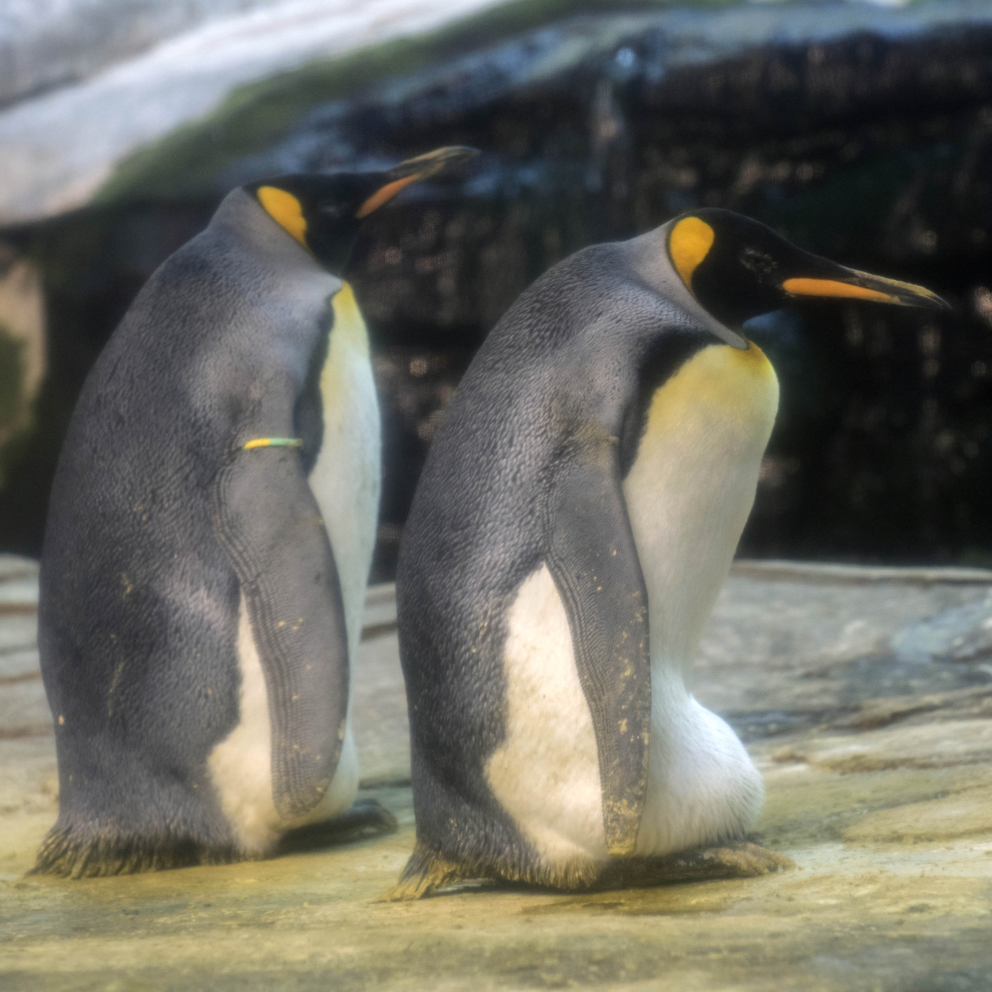
The lives of male and female penguins are not as different from each other as we may expect. Regardless of sex, a parent’s responsibilities are similar—both invest equally in raising their chick. Aside from reproductive barriers, there is no reason why same-sex penguin couples cannot be successful parents. Penguins often lay more than one egg, though only one is likely to survive. In captivity, a same-sex penguin couple can adopt any extra eggs (though sometimes they steal eggs instead.) It’s likely that this happens in the wild too—though it’s harder to say. Visibly, male and female penguins really only differ in size, and not by much. That means it’s difficult to tell male and female penguins apart and even more difficult to identify any wild mating pairs as homosexual.

Rocky and Marama at SEA LIFE London.

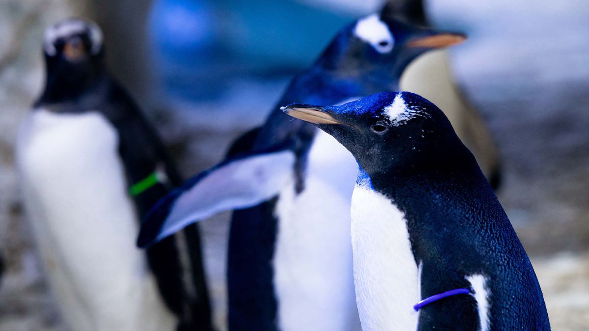
In late 2019, mothers Rocky and Marama hatched a baby Gentoo penguin at SEA LIFE Aquarium in London. This baby Gentoo made further waves after the aquarium announced that it would not be assigning the chick a gender. The chick is identified with a gender-neutral purple tag rather than the usual gendered name and color coded tag. Beyond that, the penguin’s life will be the same as any other penguin at the Aquarium. Gender means nothing to penguins, so why have we continuously assigned it to them? The General Manager of the aquarium, Graham McGrath comments that the decision to raise a genderless penguin is following an increase in conversations around human gender neutrality. I applaud SEA LIFE London for taking a look at their practices and making changes based on a more nuanced understanding of gender.

The genderless penguin at SEA LIFE London, identified with a purple tag.

Besides, the animal kingdom is constantly subverting our expectations for both gender and sex. Male seahorses famously carry the young while they develop, and are the ones who eventually give birth. Bluehead wrasses all hatch as female. As they mature, some develop into males. These stories should be highlighted more. Most zoos and aquariums stick pretty exclusively to scripts around environmentalism and conservation. While those are incredibly important topics, I would like to see these institutions branch out. For example, a common argument against LGBTQIA+ rights is that “it’s not natural.” Zoos and aquariums have an opportunity to step in and say “actually, that’s not true.”

What We’re Reading: Memory Palace: Gallery 742

Today’s post is a little bit different – a combination of our What We’re Reading series and our Museums Gone Viral series. Here, Julia Kahn, a Tufts student in the Museum Studies and Art History programs, discusses a podcast she discovered while at the Metropolitan Museum. For a look at the gallery the podcast accompanies, check out this article.

For those of you that include podcast among your “reading” material, here’s a really interesting piece with implications for museums. The Metropolitan Museum recently installed a new decorated room in their American Wing, and have partnered with Nate Dimeo, who makes a podcast that tells vignettes of little known histories. In “Gallery 742,” the bite-sized podcast tells a narrative about the nineteenth century New York socialite who originally designed the elaborate dressing room. The story incorporates some of the salacious details of her life, while inviting us to image ourselves back on a particular day in the 1880s. I found this to be quite a lovely piece to hear, especially when I replayed it standing in front of the room. It is what motivated me to seek out this little exhibit on a recent trip to the museum. It made for a very memorable and intimate experience is this personal, unusual room. It helped me transport myself over the Plexiglas barrier and feel like I was momentarily part of that world.

I’m intrigued by the possibilities of how more museums may incorporate new technologies and trends into their visitor experiences. The podcast medium seems like it may offer some rich possibilities. It allows another (non-“expert”) voice to offer an interpretation. It encourages visitors to use their own phones rather than rent extra museum audio guides. It is available outside the museum as an advertisement or follow-up experience, and is inclusive to people who may be far away. In this case, it also emphasized emotional narrative over informational data points, which is probably more appropriate for a complete, decorated room.

There were some logistical issues with this example. For one thing, it was pretty long to listen to while standing there in the gallery, blocking vantage points for other visitors. And it was awkward for my whole group to try to cluster around my iPhone. Even with these inconveniences, I hope that the Met and other museums continue to think about how to use platforms like podcasts to compliment and extend their exhibitions.

And definitely listen to the story of Belle Worsham. It’s a trip!

Digital Media Critique: The Isabella Stewart Gardner Museum

Today we bring you an article by Christina Errico, currently a Tufts student in the Museum Education Master’s program. For the Tufts course Museums and Digital Media, students investigate and critique the real ways that museums are implementing a variety of digital media.

As I made my way through the tapestry room of the Isabella Stewart Gardner Museum, I noticed one small, unassuming black stand with an iPad. The visitor had three options from the main menu of the iPad: to watch a video detailing the cleaning and restoration process of one of the tapestries, to scroll through slides that told the story of five of the tapestries collectively, and to scroll through another set of slides that discussed the acquisition of the tapestries by Isabella Gardner herself. But as I explored the entirety of each option on the iPad, I found myself conflicted about whether or not I found this use of digital media successful. What I did like about it was the video explaining how the tapestry was restored. I felt like I was getting a ‘behind the scenes’ look at one aspect of the conservation process. The slide show about the acquisition of the tapestries was also nice; however, there were only three slides with basic information and I wanted a bit more insight and some interesting or notable facts about the acquisition process.

The slide show about the five tapestries in the room that collectively told the life story of Cyrus the Great, founder of the Persian Empire, was what I struggled with the most. For each of the five tapestries there were 1-2 slides describing the scene from the tapestry, and while the content of this slide show was quite well done and informative, the way in which it was delivered was what I believed to be the problem. The tapestry room itself is quite large and it is hard to see the details of all of the tapestries at once. Each tapestry has similar colors and because the slides only showed certain parts of each tapestry and not the entire piece, it became difficult to identify which tapestry the slide was discussing without walking over to each tapestry and looking for the recognizable image from the slide. Although the slides showed the tapestries in the order of the story, all of the tapestries were out of order on the walls and interspersed with a totally different cycle of tapestries. I found myself confused as I tried to compare the images from the iPad to the images in the tapestries because I had assumed that the tapestries were hung in order. I personally felt that, for this slide show, the use of digital media was not necessarily successful. Because the slides were not videos, they could easily have been put onto laminated sheets of paper and placed in front of each respective tapestry. This would make it easier to be looking at the slides and the respective tapestry at the same time, and the sheets could have the corresponding number of the tapestry on them so the visitor could view them in order. The museum already uses laminated sheets of paper to label works of art in every other room, so the sheets would not look out of place. For the rest of the digital media (the acquisition slides and the restoration video), however, I thought the use of digital media was absolutely appropriate.

In terms of the aesthetics of the iPad, I felt that since it was very small and discreet, it didn’t compete with the grandeur of the room itself or the art inside the room. The iPad was installed inside the black stand so all the visitor saw was the screen, which made the screen seem more streamlined and like it was part of the exhibit. It was not something that you would immediately notice upon entering the room and I enjoyed that I had the choice of whether to participate or not, instead of a glaringly large screen playing the videos and slides on repeat which would have distracted from the art and my experience. The iPad was very easy to use and I also enjoyed that there was the option to take a short survey because I felt that the museum truly cared about how this digital media installation worked and wanted to use my feedback to make it better. Despite the drawbacks of the Cyrus the Great slide show, I think the iPad complemented the non-digital elements and was a good used of digital media in the Gardner Museum.

Museums Gone Viral: PEM Turner Apothecary Mood-O-Meter

Many museums struggle with maintaining a good balance of technology – enough to attract (and keep the attention of) younger crowds, but not so much that visitors who go to museums to “unplug” are unable to do so. The best solution is to give visitors options. They can sign up for the facebook and the instagram feeds; they can walk past the video touch screens. Museums Gone Viral brings you real ways that museums have used technology and the internet to reach a variety of visitor groups.

I know I’m a little late to the party, but I just recently discovered the Peabody Essex Museum’s “Mood-O-Meter.”

Screen Shot 2015-12-01 at 5.58.46 PM

A few weeks ago in the Tufts course Museums and Digital Media, we were treated to a fascinating discussion with Jim Olson, Director of Integrated Media at PEM. Among the many examples of digital media at the museum was an interactive piece created for the “Turner and the Sea” exhibition in the summer of 2014. The exhibition focused on Joseph Mallord William Turner’s work and his multitude of work focused on different depictions of the sea. Turner has such a wide variety of emotions poured into his work, some more abstract than others, that the PEM team decided to create a “period-appropriate” apothecary website. The site takes you through a series of questions and choices based on your mood, and then spits out a Turner painting that might match your current feelings.

Turner and I agree on my choice of a bright pink "Rose Madder" as my color of choice

Turner and I agree on my choice of a bright pink “Rose Madder” as my color of choice

I think this is a great way to get people more involved in the exhibition, and I love that you can access it at home as well as in the exhibition (when it was up, the space included ipads that hosted the site). The Mood-O-Meter is fun and slightly cheeky, which makes you want to use it again and again, finding a Turner piece for every mood you might have. Beyond the amusement, it dives deeper into Turner’s painting methods, asking users to pick a color of paint that they feel drawn to and explaining how it was created or used.

The website fosters a feeling of personal investment in the painting – after all, your mood might be close to Turner’s when he painted it, or perhaps to the mood of the sea on that day, and it creates a desire for visitors to take a closer look at the painting and spend more time with it. You can even access the Mood-O-Meter at any time, even though the exhibition closed over a year ago. If you know that the website is there, you can continue exploring Turner and his artwork for as long as you please. Check it out here.

Playful and funny, the Mood-O-Meter even has you choose your cheese preference before telling you about Turner's own love of cheese.

Playful and funny, the Mood-O-Meter even has you choose your cheese preference before telling you about Turner’s own love of cheese.

Here is what the Mood-O-Meter decided I would enjoy looking at based on my mood (click on the image to zoom in):

Screen Shot 2015-12-01 at 6.03.21 PMI have to say that I did enjoy it, probably more than I would have if I was just encountering the painting on my own. I don’t generally like or truly appreciate works of art that are more abstract, but I found myself looking more closely at the chosen painting for ways to connect my mood with the piece.

If you want to know more about how the Mood-O-Meter came about, check out this discussion with creators Jim Olson and Caroline Herr.

Museums Gone Viral: Chicago’s Talking Statues

Many museums struggle with maintaining a good balance of technology – enough to attract (and keep the attention of) younger crowds, but not so much that visitors who go to museums to “unplug” are unable to do so. The best solution is to give visitors options. They can sign up for the facebook and the instagram feeds; they can walk past the video touch screens. Our new series, Museums Gone Viral, brings you real ways that museums have used technology and the internet to reach a variety of visitor groups.

Chicago, well known for its plethora of outdoor art, has recently stepped up its art game. This summer, statues all over the city began to talk. People can find a statue, like that of Abraham Lincoln and Cloud Gate (the big bean), with a plaque next to it, and wave their phone over the text. They then receive a phone call “from” that statue (which shows up on the caller ID) to hear it talking to them. Anyone with access to a smartphone can engage with the usually taciturn statues. The audio covers everything from silly stories to serious monologues. The best part about the project, which will last about a year, is that it’s totally free – minus the need for a smart phone – and very community centered. The words of the statues were completely written by Chicagoans. Other local famous folks, such as producer Shonda Rhimes and actors Steve Carrell and David Schwimmer, lend their voices to the project.

The statues have been bringing together people who pass by and wonder what the big attraction is. As Colette Hiller, artistic director of the company that created the project, explains, “It’s different from an audio guide. It’s more personal; it takes you by surprise.” This is an interesting thought. The project has roughly the same format as a traditional audio guide – visitors come to an object they want to know more about, are instructed on how to access the audio, and use an electronic device to listen to information on that object. Despite that fact, the mere idea of the audio being more interesting and engaging is seen as being somehow above a regular audio guide. It brings to mind interesting audio guides completed by people like Allison Dufty, who writes fascinating audio guides for a wide variety of audiences and museums. I would be interested to hear what the talking statues project is considered, if not an audio guide.

If you are around Chicago, particularly as the holidays are coming up, head out to any number of places to get a call from the lions outside the Art Institute or the Tin Man from The Wizard of Oz. Let us know what you think! Is it worth the effort? Would you consider it an audio guide?

Keep your eyes open around Boston – it’s been reported that the same company who created the talking statues in Chicago are considering Boston as one of their next locations! I would love to hear the story that the ducklings in the Boston Public Garden have to tell.

« Older posts

Spam prevention powered by Akismet