Hello everyone! A few weeks ago, we were walking around with clipboards, asking you all which school you were in– and we could tell some of you were surprised we were asking. We do a collection of affiliation surveys every year, twice a year, and here is some of our past wrap-ups as evidence. We ask you which school you’re in, and log what time, what day, and which floor you’re on. It’s a lot of info. And, as evidence that we use this data, I will break down what this year looked like as our campus reopened and classes tentatively switched from all remote to hybrid or in-person classes.
Without further ado, let’s get started with the info I find most interesting–
Weekday & Time
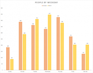
People by Weekday
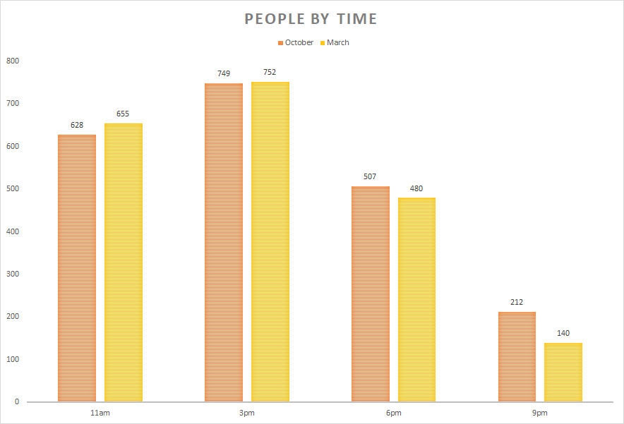
People by Time
Between October and March, the stats by weekday were pretty different. It looks like March mid-week was the most popular time to be in the library, whereas October saw a more even distribution. I really like the fact that Sundays were more popular than Saturdays in October, and March saw the opposite.
As far as times of day, the numbers almost identical– most of you were here mid-morning (11 AM) and mid-afternoon (3 PM), and then the numbers tapered off in the evening. I sort of thought the numbers would look different since we saw more of you all this semester, but maybe you’ve been here all along… hiding on the 7th floor.
Floor
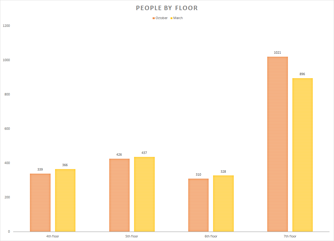
People by Floor
I love the distribution for how many students are on which floor. Why? Because we here at the library know you all love the 7th floor. It is consistently the most populated of all the floors, and as you can see, by about double the other floors’ totals. You all make great use of the study rooms, the double-tier desks, the standing desks, the cubicles– but here’s the proof, in case you’ve ever been curious. You’re all using the other floors, in a pretty identical and consistent way, and man, we are still grateful to be seeing you all in person again.
Affiliation
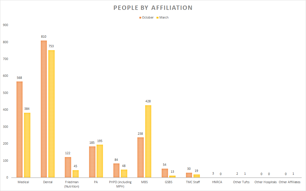
People by Affiliation
Last but not least, the statistics based on department (or, affiliation). Classically, the majority of students using the library have been the medical and dental students. However! We counted a lot of MBS students this March, nearly double that of October, which is fantastic! Thank you everyone for using the space, for patiently telling four people in one day which school you went to, and for being the best part about working at Hirsh Library. We have been lucky to see familiar and new faces alike this academic year, and look forward to seeing you around the library. And get ready, because six months from now… we have the next round of affiliation surveys! 🤭
Share this post!


Follow Us!


