
GIS Poster Expo
Geographic Information Systems (GIS) are amazingly powerful tools. Take a few moments to study a well-designed map, and you’ll be amazed by the different types of information it can simultaneously convey. Way back in my own student days, I enrolled in the inaugural offering of GIS for International Applications at Fletcher, mostly out of curiosity and the desire to pick up the rudiments of a new skill set. While I haven’t gone on to do further GIS work, and while “modest” would be a charitable description of the mapping project I produced in that course, it did leave me with an understanding and appreciation of the explanatory power of contemporary mapping technology and technique.
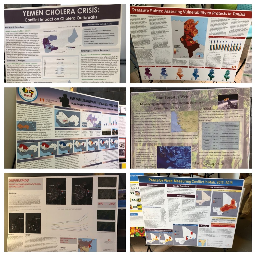 It was a treat, then, to trot down the hill one afternoon last week for the 2019 GIS Poster Expo, sponsored by the Tufts Data Lab. GIS applies to lots of disciplines and schools at Tufts, so the Poster Expo is a good representation of the larger Tufts community. Undergrads in a variety of majors displayed work, as well as grad students from Fletcher, Urban and Environmental Policy & Planning, the Friedman School of Nutrition Science and Policy, and several other departments. I of course gravitated toward the work of Fletcher students in particular (a selection of which you see here), but really enjoyed seeing the expansive spectrum of GIS work from all parts of Tufts, from visualizing changes in the number of minority-owned small farms in Massachusetts to international conflict mapping to identifying the best sites for wind farms in the Eurasian steppes. Among the Fletcher work I was able to check out was an analysis of cholera outbreaks in the ongoing conflict in Yemen, the regions of Tunisia most likely to experience bouts of election-related protests, tracking jihadist activity in the Sahel, the use of remote sensing to identify mangroves in Sierra Leone, measuring economic development in the Russian and Chinese far east via nighttime lighting density, and monitoring violence against international peacekeepers in Mali.
What I really like about GIS is its fairly equal emphasis on technical and aesthetic skill: an effective map needs to be underpinned by solid data and statistical work, but must also be presented in a coherent, succinct, and eye-catching fashion. The best maps are able to elegantly layer disparate data sets into a compelling visual, and most entries at the GIS Expo either implicitly or explicitly make a policy argument in their presentation. Two will be selected as “Best of Show” prize winners, with five runners-up also being honored. GIS is a growth area both at Fletcher and Tufts at large, and prospective Fletcher students with an interest in data visualization will find increasing opportunities to build or deepen those skills.